Rebranding Services
Change what is holding you back. Keep what people recognise.
- 2–5 weeks depending on scope
Rebranding carries a risk nobody mentions in the pitch: you can throw away recognition you spent years paying for.
So we start by establishing what is actually worth keeping. Sometimes the mark is fine and the problem is inconsistent application. Sometimes the name no longer describes what you do and a full change is justified. Those are very different projects, and the honest answer is often the smaller one.
Where a rebrand is right, the rollout matters as much as the design — signage, vehicles, stationery, packaging, website, social profiles and listings all need sequencing so you are not half-old and half-new for six months.
Work we have delivered
Pieces we produced for real clients. Never stock, never a template.
What's included
- Audit of existing brand equity
- Honest recommendation — refresh or rebrand
- Stakeholder and customer perception input
- New or evolved identity design
- Transition strategy and phasing
- Application rollout across all touchpoints
- Announcement and launch materials
- Updated brand guidelines
How we work
- 01 Discovery Business, audience, competitors and what the brand must signal.
- 02 Direction Moodboards and written creative direction agreed before designing.
- 03 Concepts Two to three distinct directions, presented in context.
- 04 Build the system Variations, typography, colour and applications.
- 05 Handover Guidelines document and every source file in vector format.
What you receive
- Brand audit findings
- New identity system
- Rollout plan with phasing
- Updated applications
- Launch materials
- Brand guidelines
Questions people ask
Refresh or full rebrand — how do I know?
If customers recognise you and the brand simply looks dated, refresh. If it actively misrepresents what you now do, rebrand. We give a straight recommendation after the audit, including when it is "do nothing yet".
Will I lose customer recognition?
Not if it is handled properly. An evolution keeps recognisable elements; a full change needs a communication plan so customers are brought along rather than surprised.
What does a rollout involve?
Everything carrying the old identity — signage, vehicles, stationery, packaging, website, social profiles, directory listings. We sequence it so the transition looks deliberate.
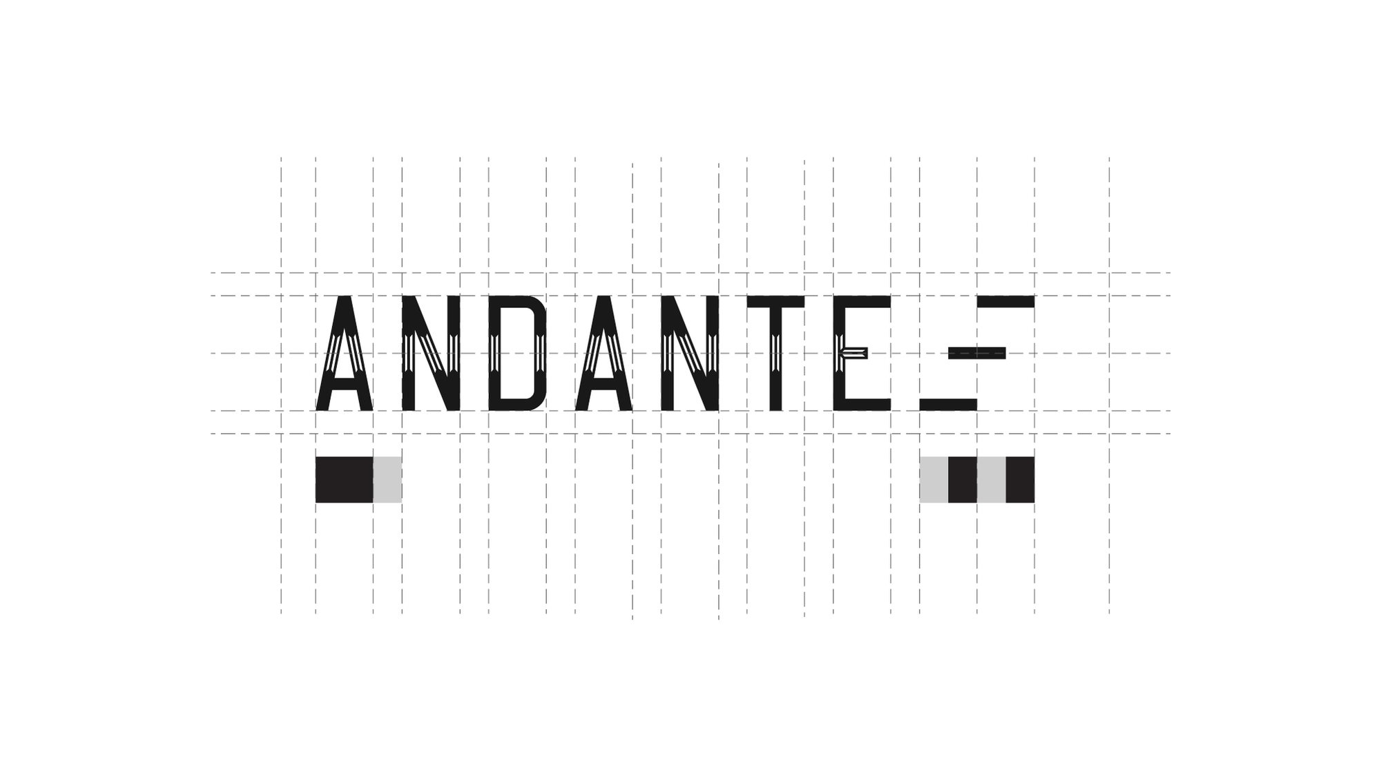
How a mark is made
Nobody draws a logo freehand.
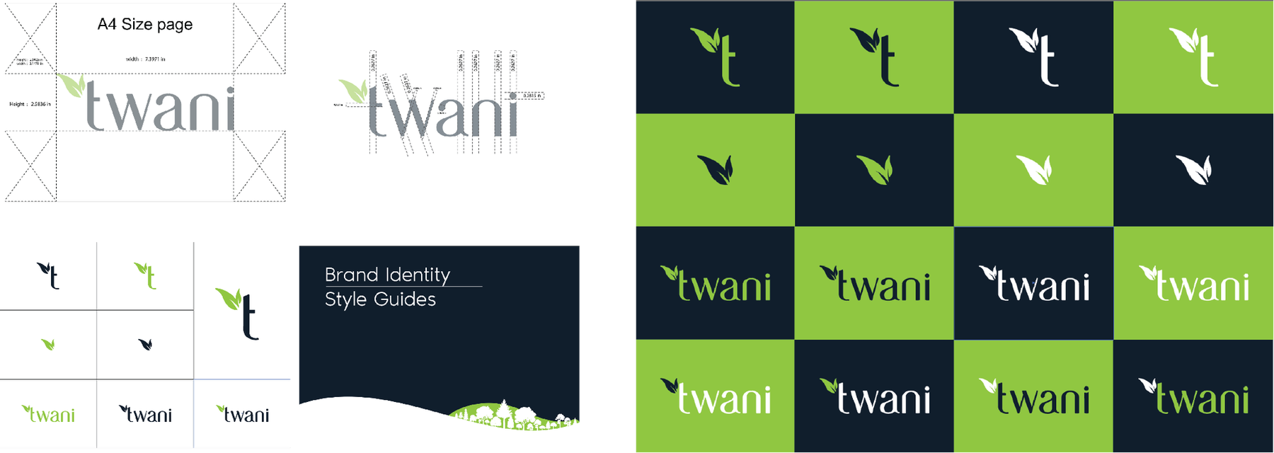
It is built on a grid, so the spacing between the A and the N is the same relationship as the spacing between the T and the E. That is the difference between a mark that looks right at any size and one that only looks right at the size it was drawn.
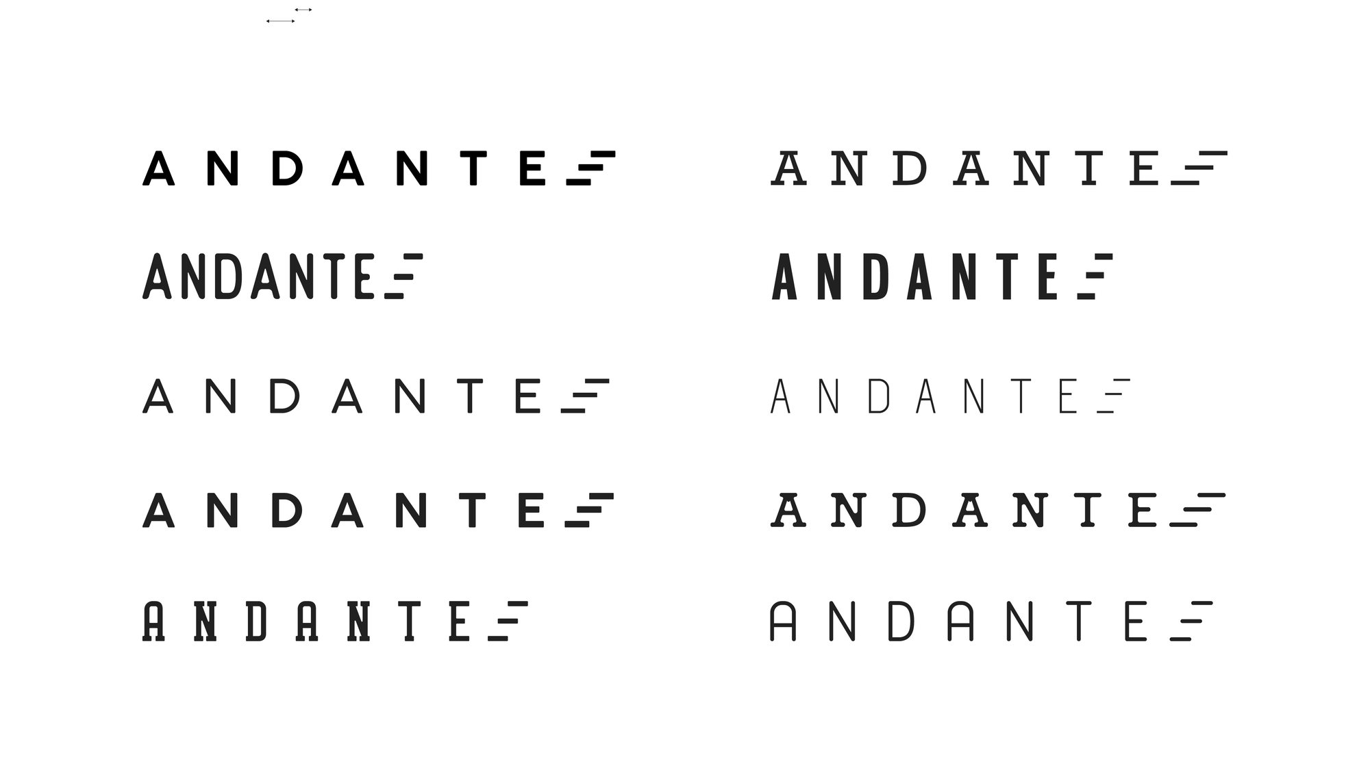
Then it gets tested — weights, widths, spacing, and what survives when you take the colour away.
Redesigns
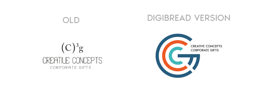
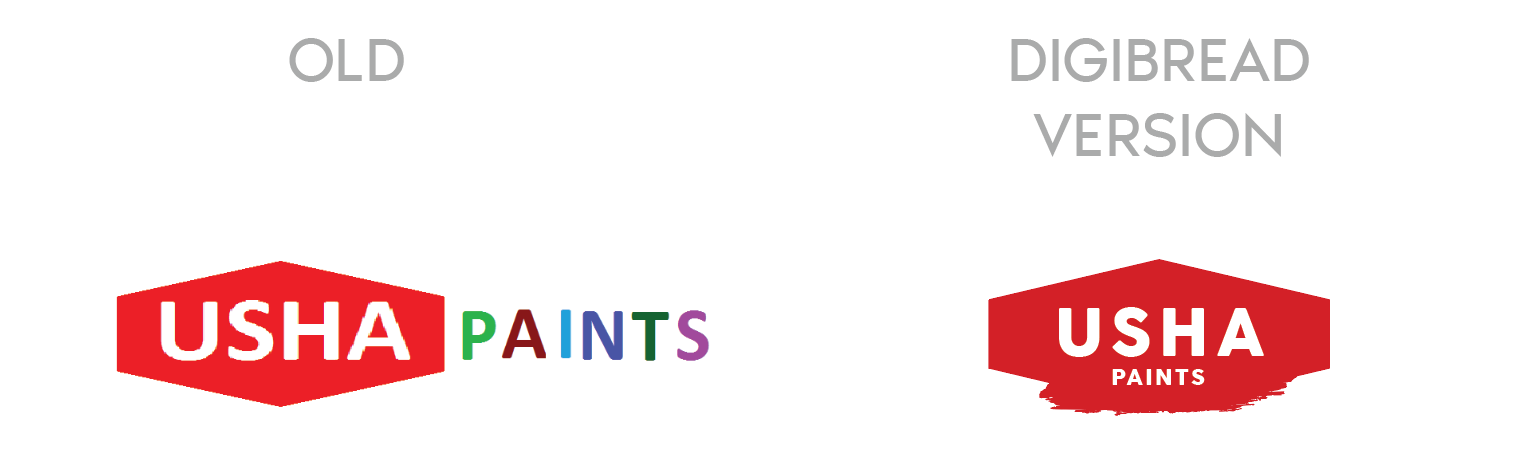
The mark on the left is what walked in the door.
A rebrand is not a fresh start. The job is to keep whatever recognition the old mark earned and throw away the rest.
-
USHA Paints
The old mark had two competing weights and no shape of its own. The redesign keeps the equity in the name and gives it a container that survives being stencilled on a tin.
-
Creative Concepts
A typed superscript replaced with a drawn monogram — the same two letters, but now something that can be embroidered, embossed and read at 12mm.
-
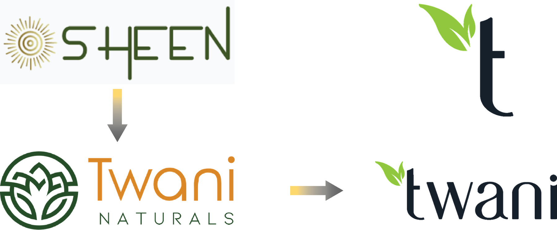
SHEEN to Twani
A full rename, in two moves. The leaf that was decoration in the middle version becomes the stem of the t in the final one.
One brand, sixteen answers
You see one logo. There were fifteen others.
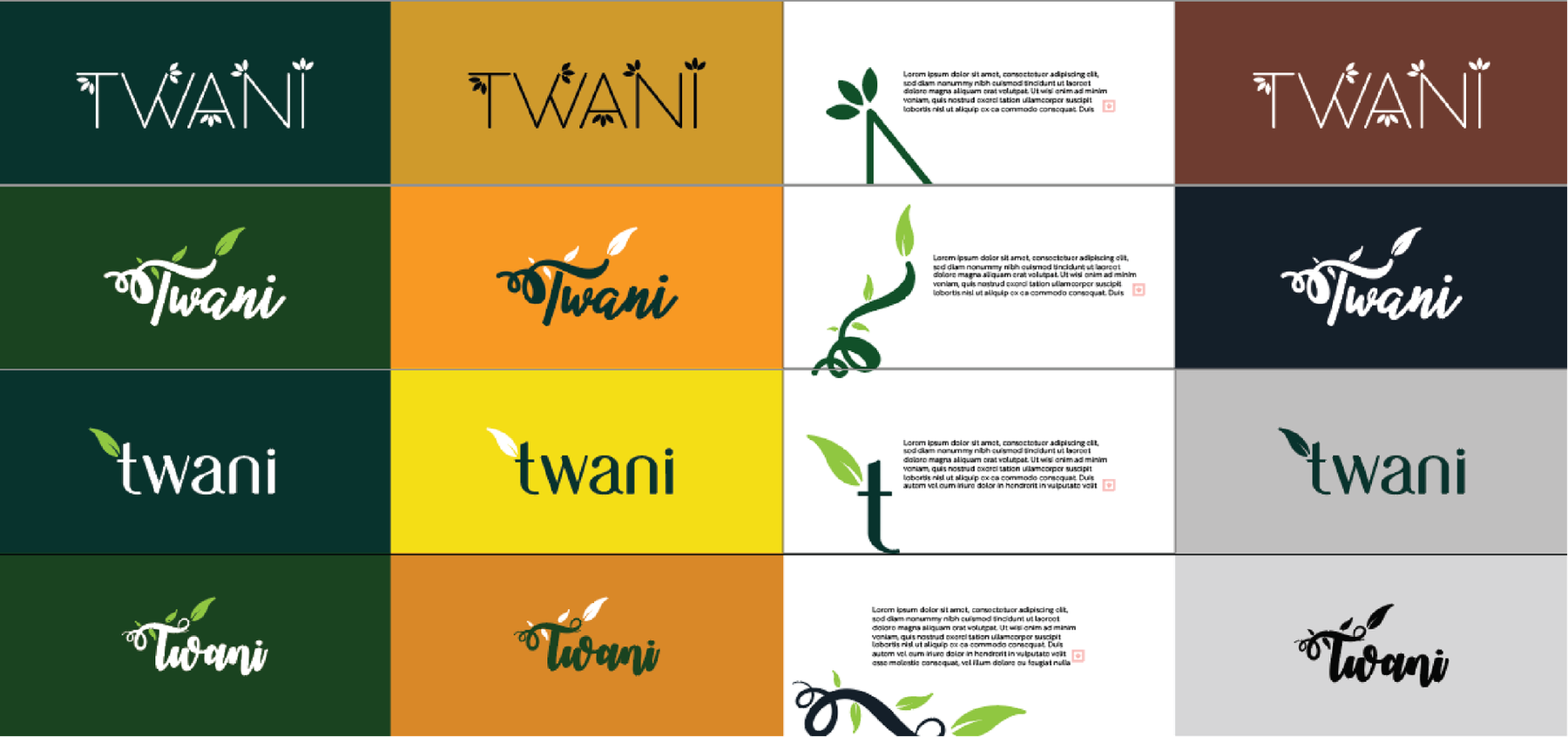
Presenting a single option is a way of hiding the work. Every route below was drawn properly, set on four different grounds, and shown side by side — because the only way to know a mark is right is to see what it beat.
-
Four families, sixteen routes -
Each one tested on four grounds -
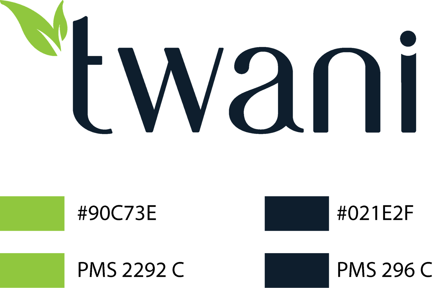
The chosen mark, specified in Pantone
The wall
Marks we have drawn or rebuilt.
27 of them