Packaging & Label Design
Your last advertisement before the buying decision.
- 2–4 working days for most single pieces

Packaging is the only advertising that reaches a customer at the exact moment of choosing. On a shelf next to eight competitors, it does more selling than any campaign.
We design packaging and labels that hold up in that context — legible at a metre, distinctive in the category, and compliant with the declarations Indian regulations require without letting the mandatory text swallow the design.
We work to dielines, and if you do not have one, we will get it from your converter before designing rather than after.
What's included
- Category and shelf-context review
- Dieline-accurate structural design
- Front-of-pack hierarchy for shelf legibility
- Mandatory declarations laid out compliantly
- FSSAI, net weight and barcode placement
- Variant systems across a product range
- 3D mock-up visualisation
- Print-ready artwork for your converter
How we work
- 01 Brief What it is for, who sees it, and what it must make them do.
- 02 Concepts Usually two distinct directions rather than variations of one idea.
- 03 Refine The chosen direction developed fully, with two revision rounds included.
- 04 Deliver Print-ready and web exports, plus editable source files that are yours.
What you receive
- Print-ready packaging artwork
- Dieline files
- 3D mock-ups
- Variant designs
- Editable source files
Questions people ask
What is a dieline?
The flat cutting template your packaging converter works from — every fold, cut and glue tab. Designing without it is how artwork ends up printed across a crease.
Do you handle regulatory requirements?
We lay out the required declarations correctly — FSSAI, net quantity, manufacturer details, barcode. Confirming the specific claims remains yours, since only you know the product formulation.
Can you design a whole range?
Yes, and a range should be designed as a system so variants are distinguishable while the brand stays recognisable.
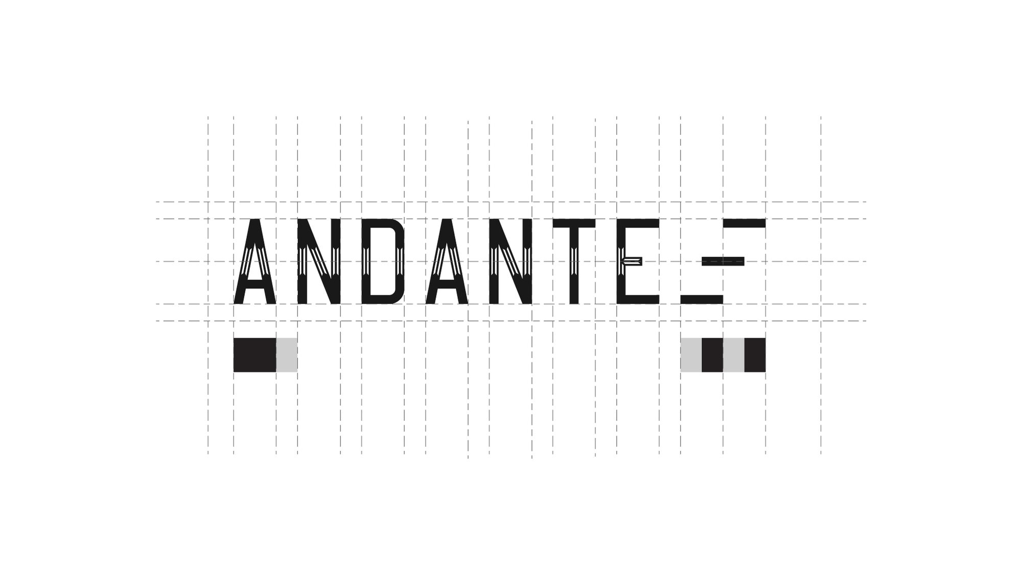
How a mark is made
Nobody draws a logo freehand.
It is built on a grid, so the spacing between the A and the N is the same relationship as the spacing between the T and the E. That is the difference between a mark that looks right at any size and one that only looks right at the size it was drawn.
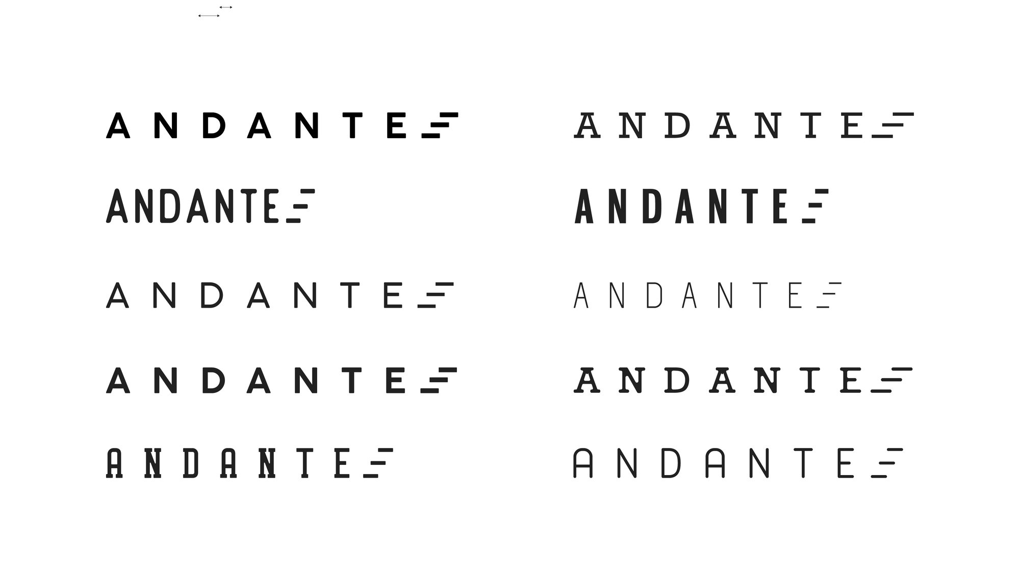
Then it gets tested — weights, widths, spacing, and what survives when you take the colour away.
Redesigns
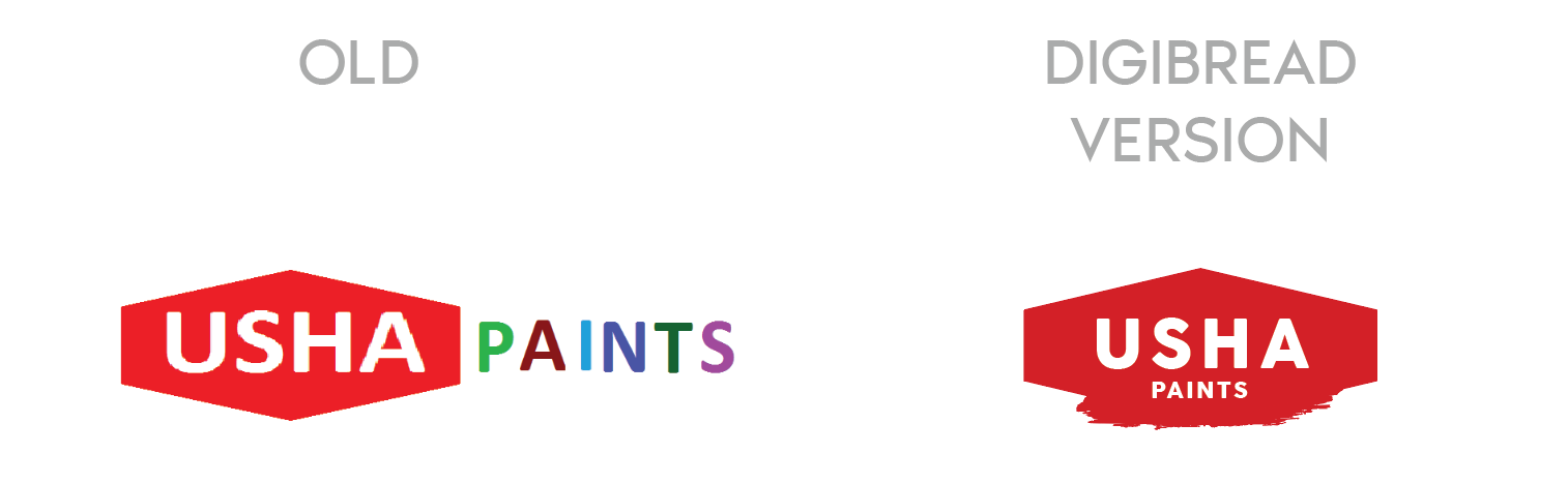
The mark on the left is what walked in the door.
A rebrand is not a fresh start. The job is to keep whatever recognition the old mark earned and throw away the rest.
-
USHA Paints
The old mark had two competing weights and no shape of its own. The redesign keeps the equity in the name and gives it a container that survives being stencilled on a tin.
-
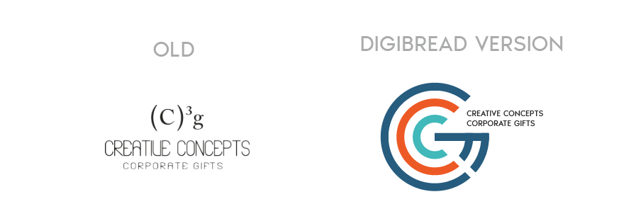
Creative Concepts
A typed superscript replaced with a drawn monogram — the same two letters, but now something that can be embroidered, embossed and read at 12mm.
-

SHEEN to Twani
A full rename, in two moves. The leaf that was decoration in the middle version becomes the stem of the t in the final one.
One brand, sixteen answers
You see one logo. There were fifteen others.
Presenting a single option is a way of hiding the work. Every route below was drawn properly, set on four different grounds, and shown side by side — because the only way to know a mark is right is to see what it beat.
-
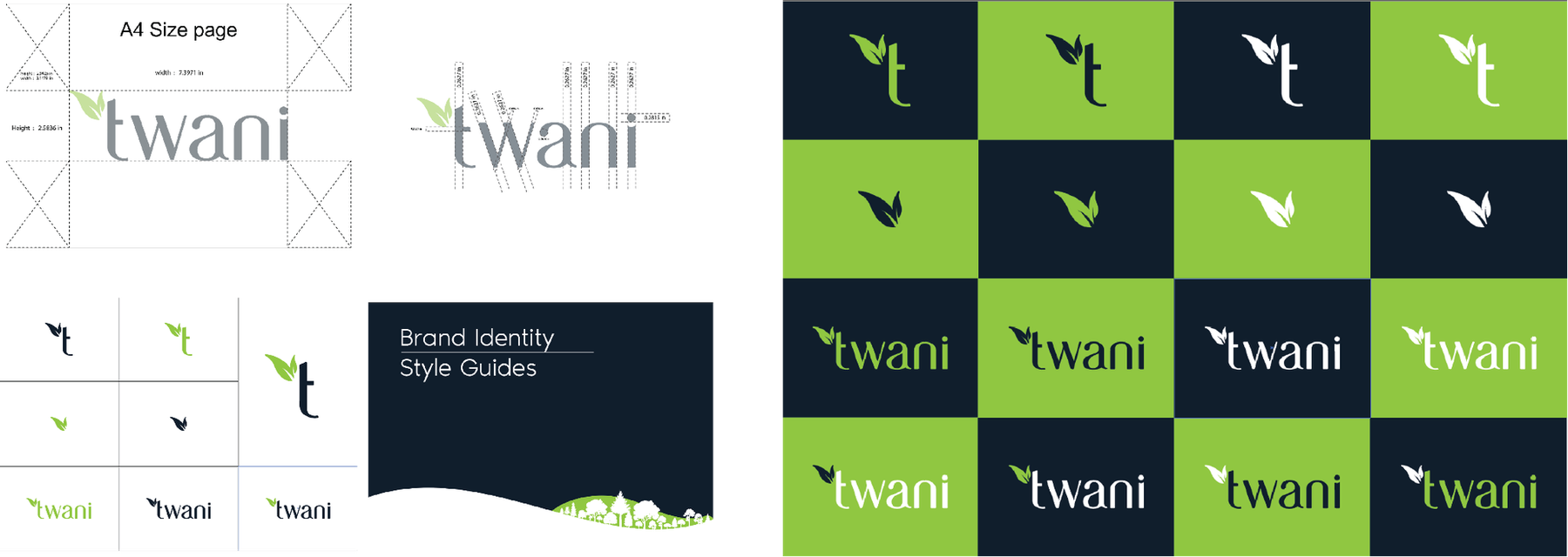
Four families, sixteen routes -
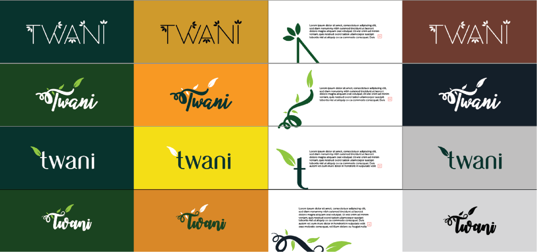
Each one tested on four grounds -
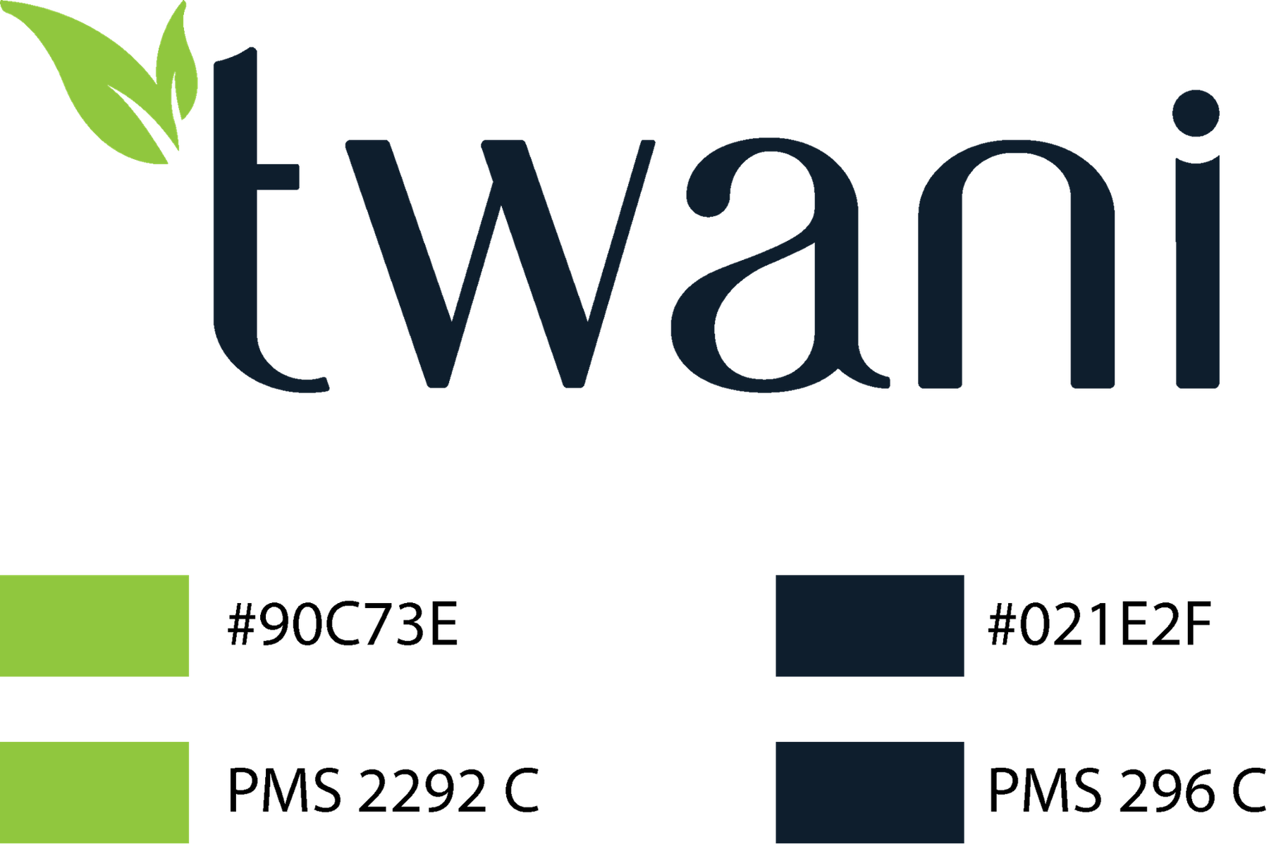
The chosen mark, specified in Pantone
The wall
Marks we have drawn or rebuilt.
27 of them