Stationery Design
Every document that leaves your office, saying the same thing.
- 2–4 working days for most single pieces
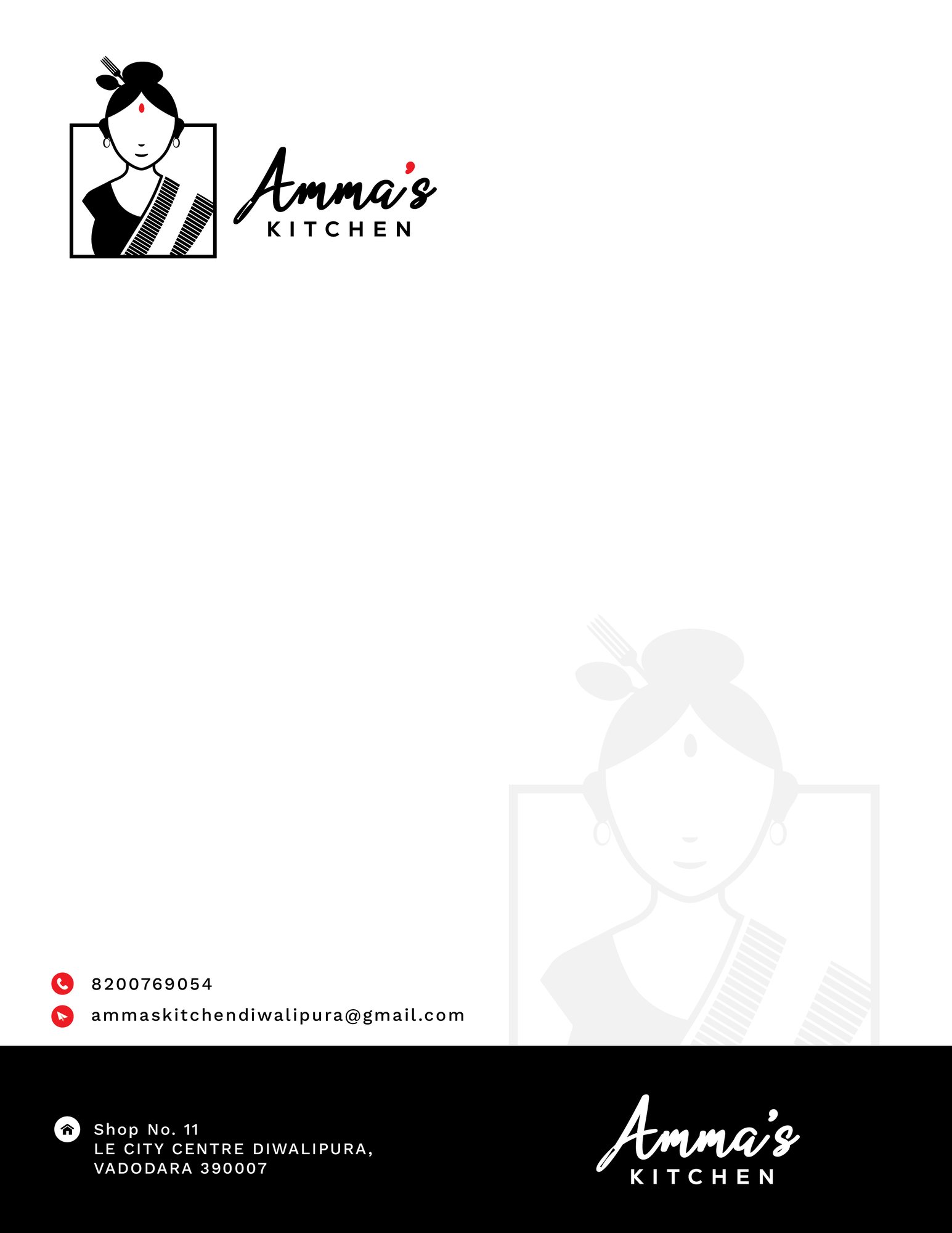
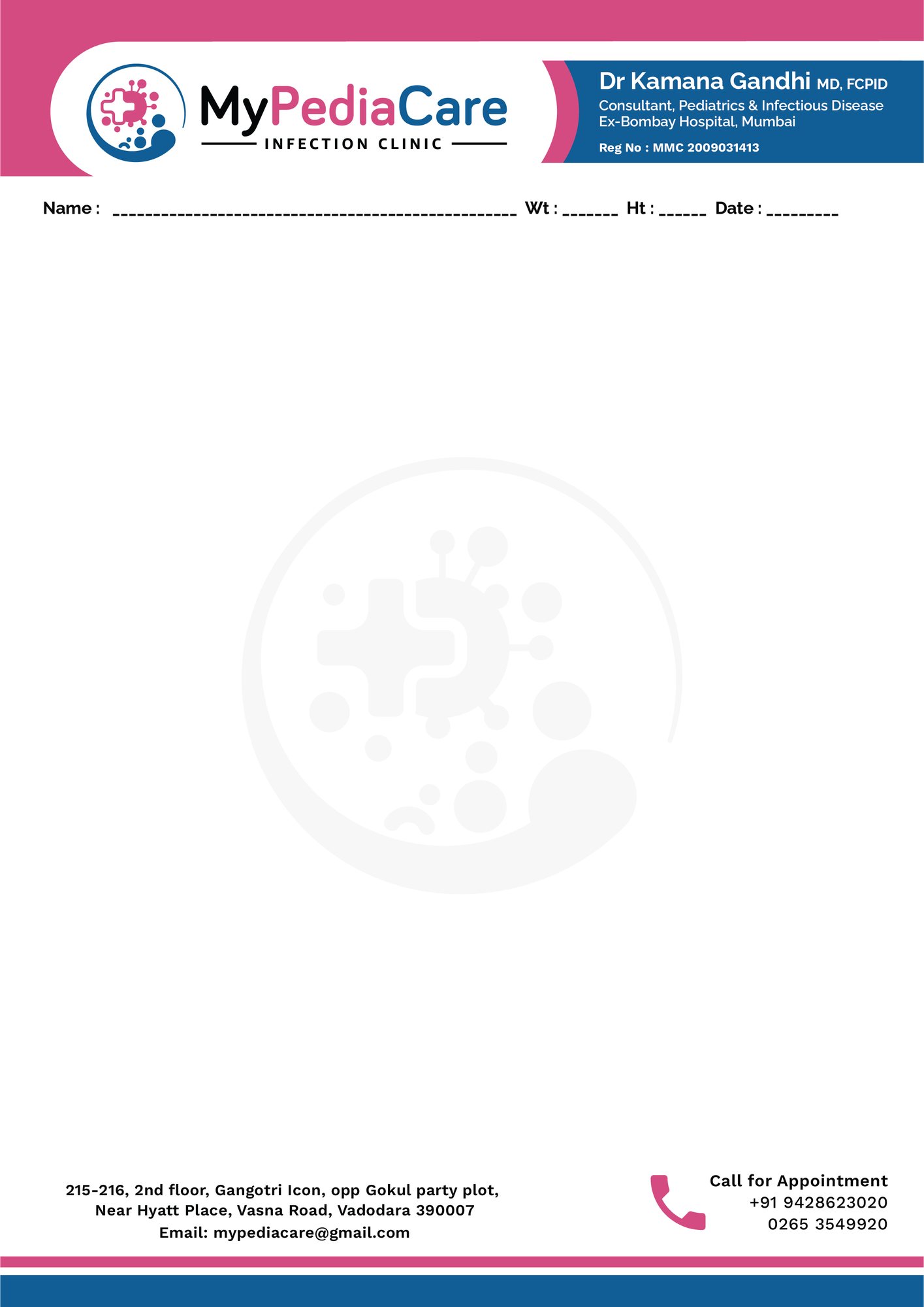
Stationery is where brand consistency is usually lost. The letterhead was designed once, the invoice was built in accounting software, the quotation template was made by whoever needed one first, and none of them match.
We design the full set as a system — letterhead, envelopes, invoices, quotations, delivery notes, folders and internal forms — so anything leaving your office is recognisably from the same company.
We supply both press-ready artwork and editable digital templates, because most of these documents are now sent as PDFs rather than printed.
Work we have delivered
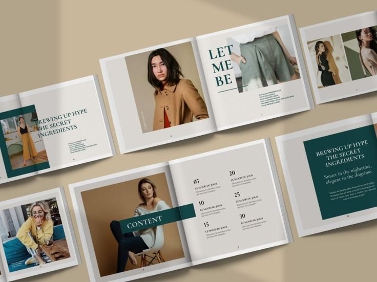
Pieces we produced for real clients. Never stock, never a template.
What's included
- Letterhead, first and continuation sheets
- Envelope designs in required sizes
- Invoice, quotation and delivery note templates
- Presentation folder design
- Internal forms and note pads
- Email signature design
- Editable Word and digital templates
- Print-ready artwork for every item
How we work
- 01 Brief What it is for, who sees it, and what it must make them do.
- 02 Concepts Usually two distinct directions rather than variations of one idea.
- 03 Refine The chosen direction developed fully, with two revision rounds included.
- 04 Deliver Print-ready and web exports, plus editable source files that are yours.
What you receive
- Print-ready stationery artwork
- Editable digital templates
- Email signature
- Editable source files
Questions people ask
Do I need printed stationery at all now?
Less than before, but quotations, invoices and letters on proper stationery still change how a business is perceived — particularly for larger orders.
Can invoice templates work with my accounting software?
In most cases yes. Tell us what you use and we will design within what it allows.
What is included in a full set?
Typically letterhead, envelope, invoice, quotation, delivery note, folder and email signature. We scope it to what you actually send.
How a mark is made
Nobody draws a logo freehand.
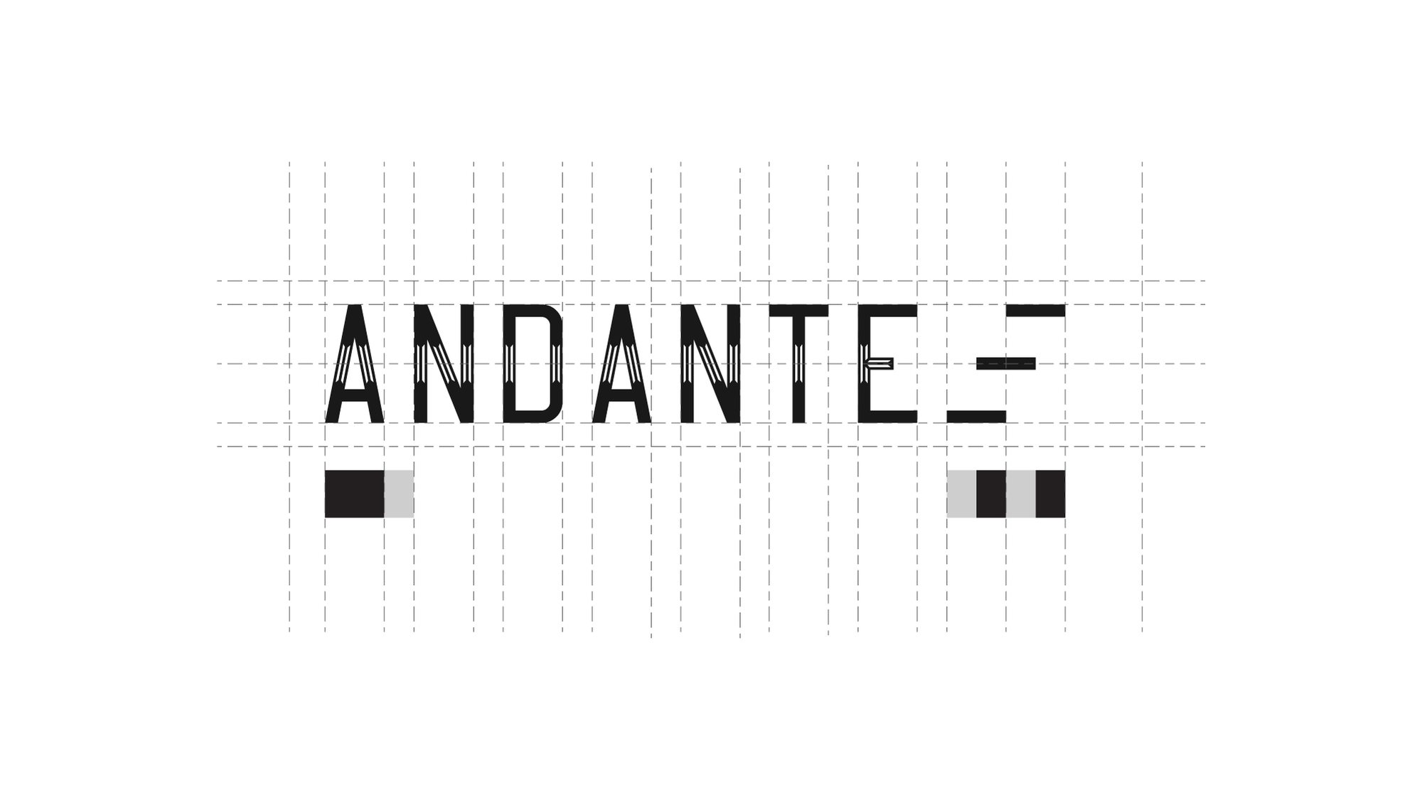
It is built on a grid, so the spacing between the A and the N is the same relationship as the spacing between the T and the E. That is the difference between a mark that looks right at any size and one that only looks right at the size it was drawn.
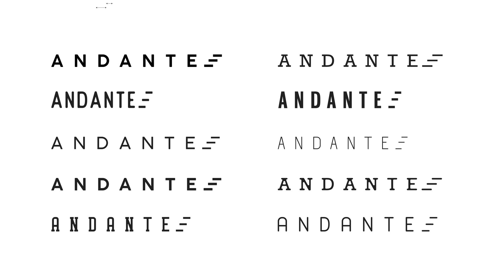
Then it gets tested — weights, widths, spacing, and what survives when you take the colour away.
Redesigns
The mark on the left is what walked in the door.
A rebrand is not a fresh start. The job is to keep whatever recognition the old mark earned and throw away the rest.
-
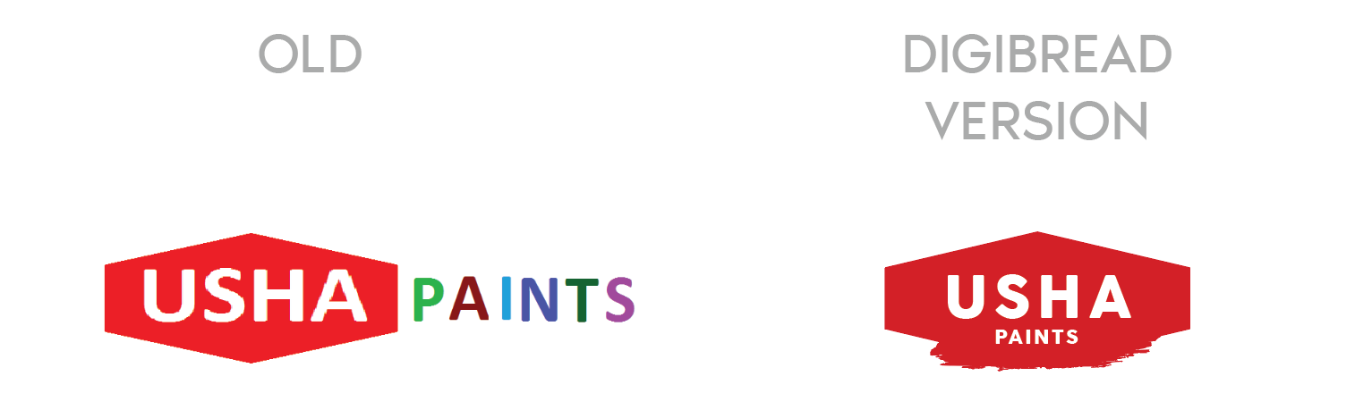
USHA Paints
The old mark had two competing weights and no shape of its own. The redesign keeps the equity in the name and gives it a container that survives being stencilled on a tin.
-
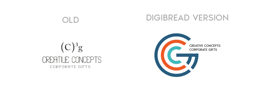
Creative Concepts
A typed superscript replaced with a drawn monogram — the same two letters, but now something that can be embroidered, embossed and read at 12mm.
-

SHEEN to Twani
A full rename, in two moves. The leaf that was decoration in the middle version becomes the stem of the t in the final one.
One brand, sixteen answers
You see one logo. There were fifteen others.
Presenting a single option is a way of hiding the work. Every route below was drawn properly, set on four different grounds, and shown side by side — because the only way to know a mark is right is to see what it beat.
-
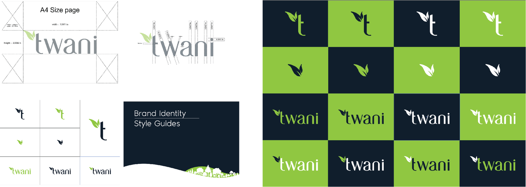
Four families, sixteen routes -
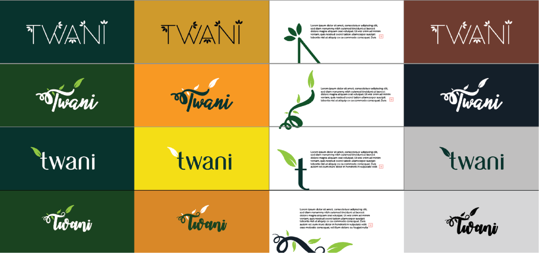
Each one tested on four grounds -
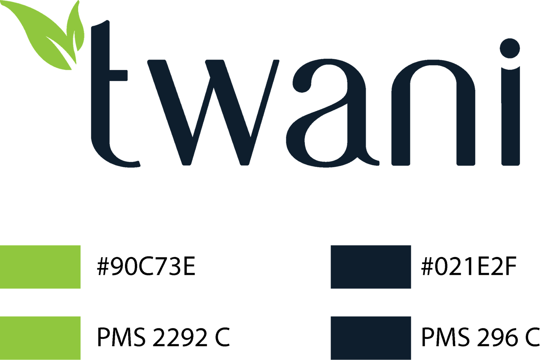
The chosen mark, specified in Pantone
The wall
Marks we have drawn or rebuilt.
27 of them