Graphic Design
Design that works at postcard size and at hoarding size.
- Most single pieces in 2–4 working days
- Per-piece or monthly design retainers available
Good graphic design is mostly invisible. You notice bad design instantly — the stretched logo, the six typefaces, the photo pulled off Google at the wrong resolution — but good design just makes a business look like it knows what it is doing.
We design for both print and screen, which matters more than it sounds. A layout that works on Instagram usually fails on a hoarding, because one is held at arm's length and the other is read at sixty kilometres an hour. Designers who only work digitally get this wrong constantly.
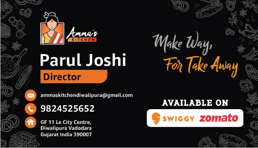
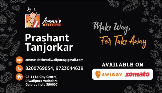
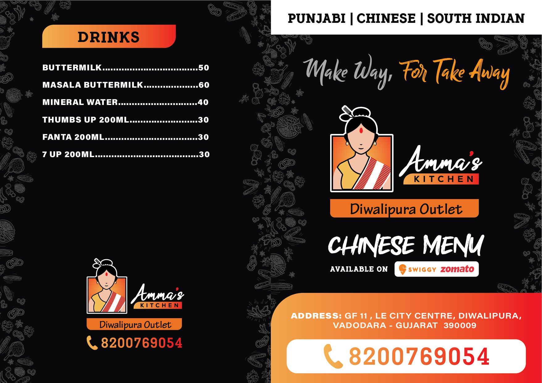
Our work covers flyers and posters, social media creatives, banners and hoardings, brochures and catalogues, packaging and labels, stationery, and business card design. Where you already have brand guidelines, we work inside them. Where you do not, we will tell you honestly that fixing the identity first will make everything after it cheaper and better.
Every file is delivered in the formats you actually need — print-ready PDFs with bleed, web-optimised exports, and editable source files. Those source files are yours. We do not hold artwork hostage.
Work we have delivered
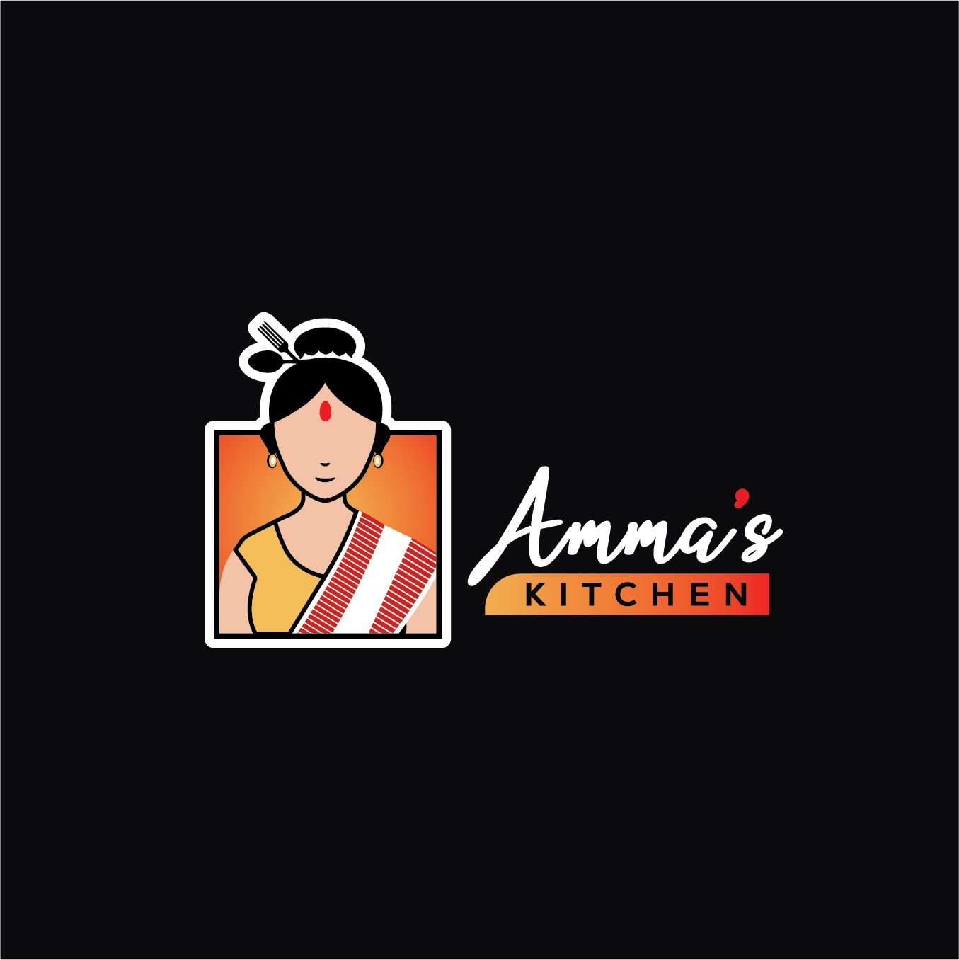
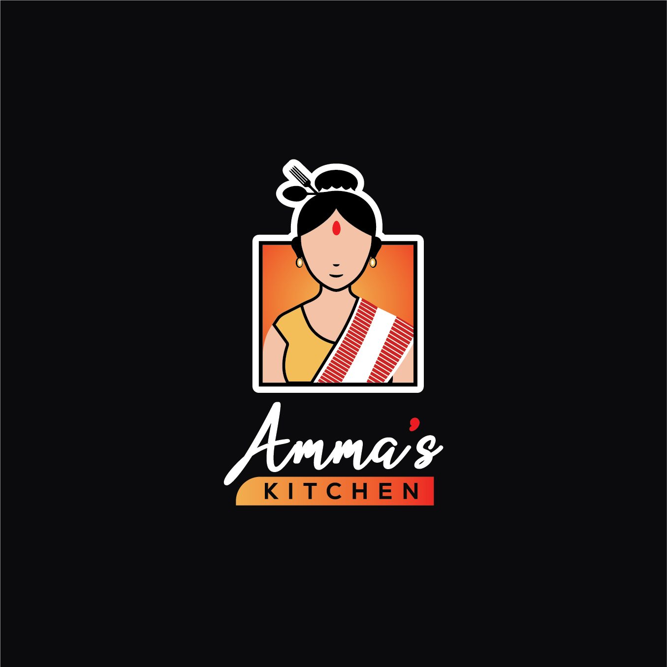
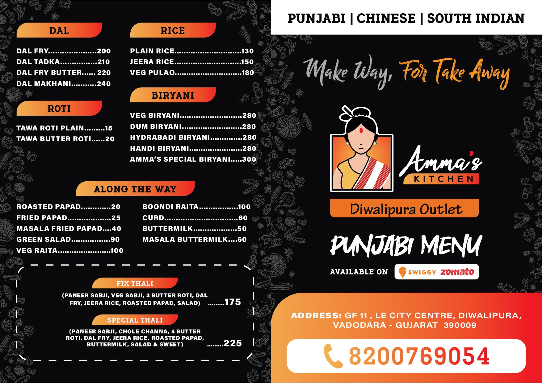
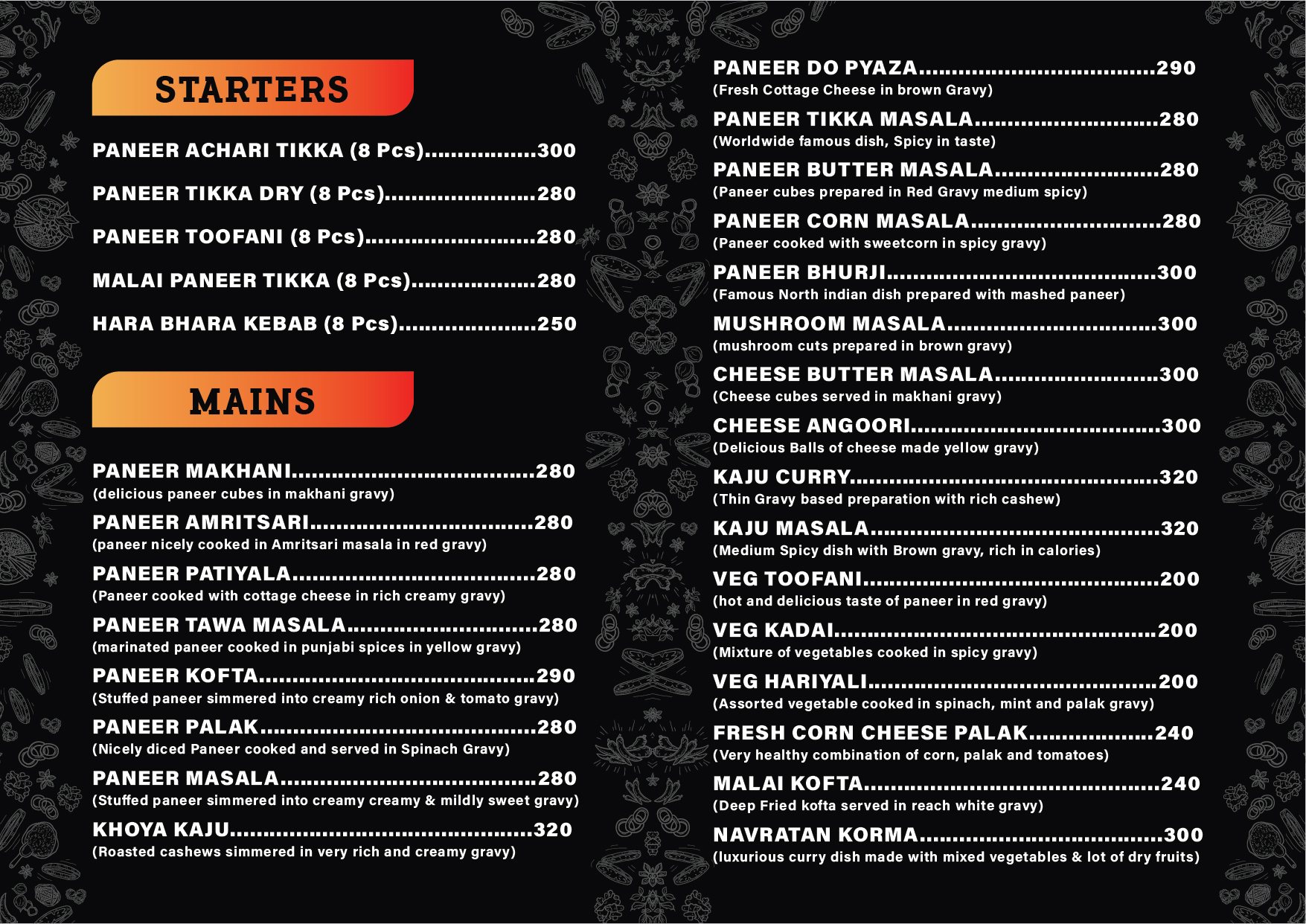
Pieces we produced for real clients. Never stock, never a template.
What's included
- Design brief and reference discussion
- Concept development, usually two directions
- Full design of the approved direction
- Two rounds of revisions included
- Print-ready artwork with correct bleed and CMYK
- Web and social exports at correct dimensions
- Editable source files handed over
- Adaptation across sizes and formats
How we work
- 01 Brief What it is for, who sees it, where it appears, and what it must make them do.
- 02 Concepts Usually two distinct directions rather than five variations of one idea.
- 03 Design & refine The chosen direction developed fully, with two rounds of revisions included.
- 04 Adapt & deliver Adapted to every size and format you need, delivered with editable source files.
What you receive
- Print-ready PDF with bleed and crop marks
- Web and social exports at correct sizes
- Editable source files
- Colour codes and font list for reuse
- Size adaptations as required
Why choose us for this
We understand print
Bleed, CMYK, GSM and finishes are second nature. Files arrive at the press correct the first time.
Two directions, not fifty
We present considered options with reasoning, rather than overwhelming you with variations.
Source files are yours
Every editable file is handed over. You are never locked to us to change a phone number.
Consistent across everything
Because we hold your brand files, the tenth piece looks like it came from the same company as the first.
Explore in detail
Questions people ask
How many revisions are included?
Two rounds on the chosen direction. In practice we keep going until it is right — we have never made a project miserable over a third revision.
Will I get the editable files?
Yes, always. Source files are handed over on completion. We think holding them hostage is a bad way to do business.
Can you work with our existing brand guidelines?
Yes, and we prefer to. If guidelines do not exist we will work from your current materials and note where things are inconsistent.
Do you provide the photographs?
We can source properly licensed images, or shoot and art-direct. We do not pull images off Google, for legal and quality reasons.
Can you design for a hoarding and Instagram together?
Yes, and they should not be the same file. We design the concept once and adapt it correctly for each medium.
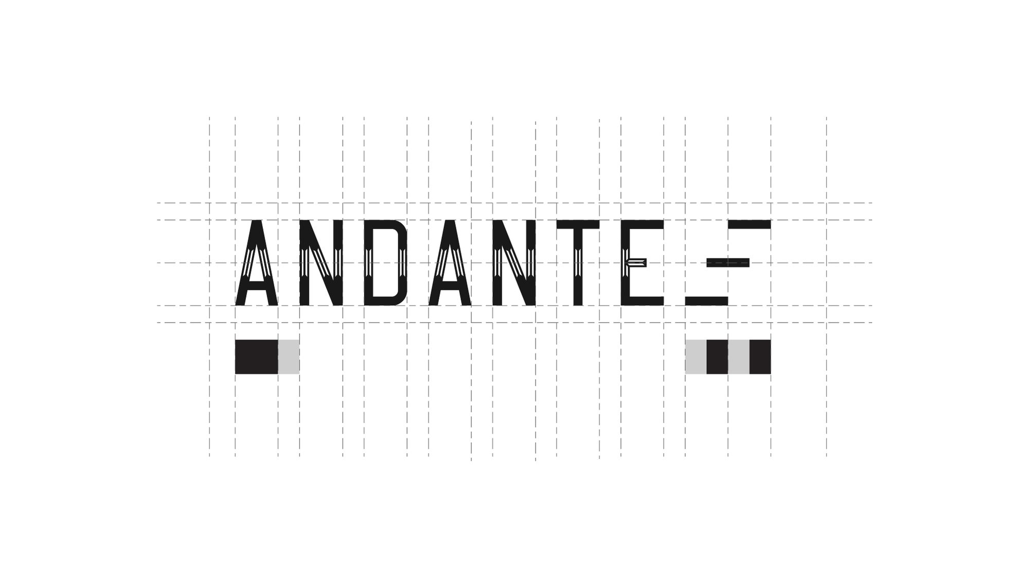
How a mark is made
Nobody draws a logo freehand.
It is built on a grid, so the spacing between the A and the N is the same relationship as the spacing between the T and the E. That is the difference between a mark that looks right at any size and one that only looks right at the size it was drawn.
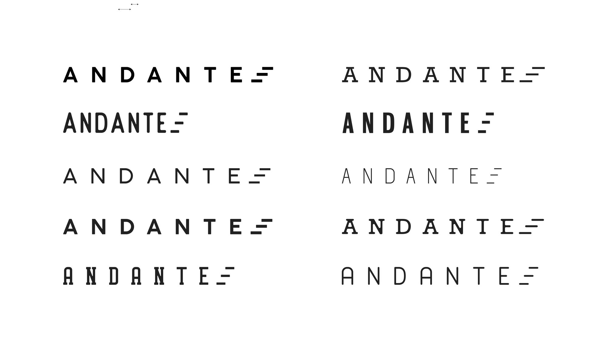
Then it gets tested — weights, widths, spacing, and what survives when you take the colour away.
Redesigns
The mark on the left is what walked in the door.
A rebrand is not a fresh start. The job is to keep whatever recognition the old mark earned and throw away the rest.
-
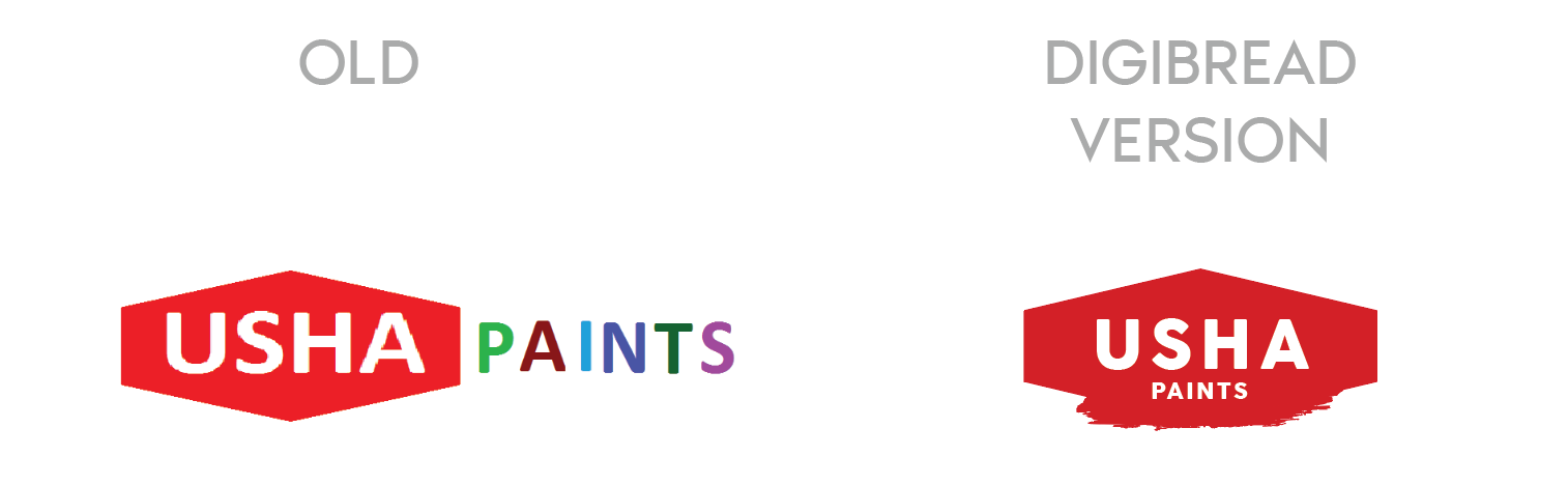
USHA Paints
The old mark had two competing weights and no shape of its own. The redesign keeps the equity in the name and gives it a container that survives being stencilled on a tin.
-
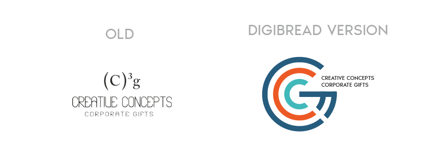
Creative Concepts
A typed superscript replaced with a drawn monogram — the same two letters, but now something that can be embroidered, embossed and read at 12mm.
-
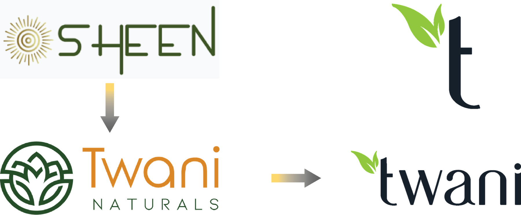
SHEEN to Twani
A full rename, in two moves. The leaf that was decoration in the middle version becomes the stem of the t in the final one.
One brand, sixteen answers
You see one logo. There were fifteen others.
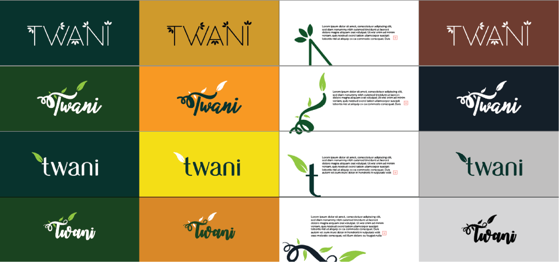
Presenting a single option is a way of hiding the work. Every route below was drawn properly, set on four different grounds, and shown side by side — because the only way to know a mark is right is to see what it beat.
-
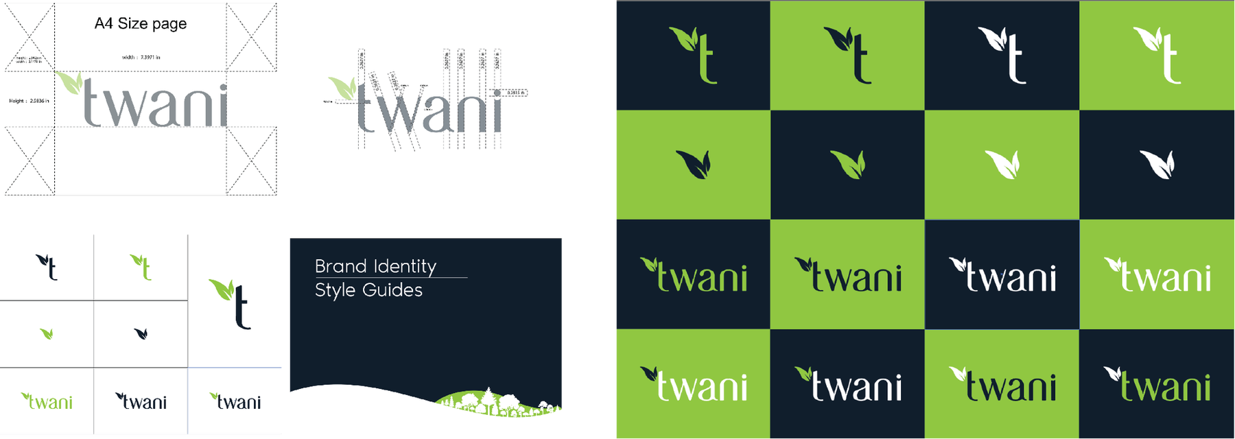
Four families, sixteen routes -
Each one tested on four grounds -
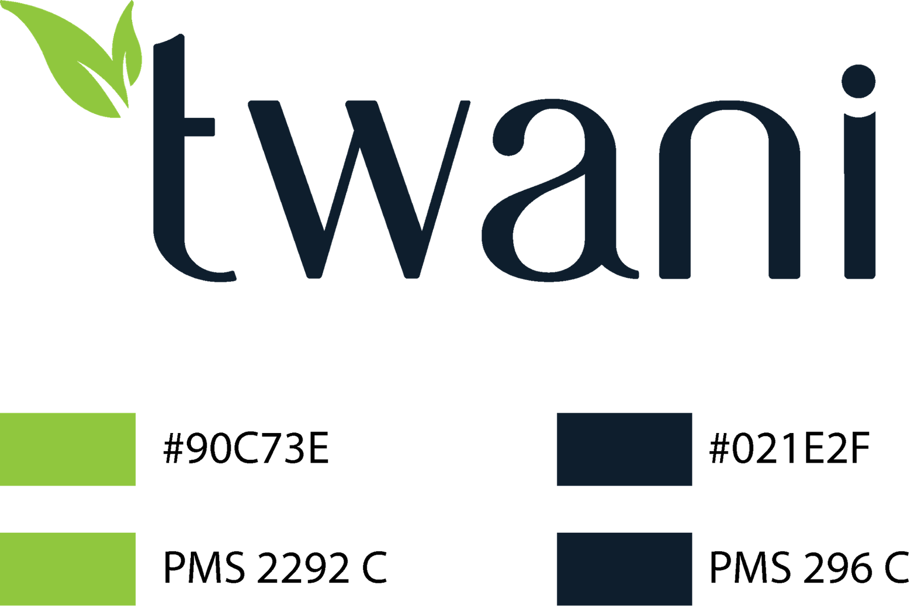
The chosen mark, specified in Pantone
The wall
Marks we have drawn or rebuilt.
27 of them