Logo Design & Brand Identity
A logo is not a brand. We build the whole system.
- Full identity typically 3–5 weeks
- Fixed-scope projects, quoted after the brief

Most businesses buy a logo when what they need is an identity.
A logo is one asset. An identity is the system that keeps every asset consistent — the typefaces, the colour values, the photography style, the way the logo behaves when it has to sit on a dark background or shrink to the size of a favicon. Without that system, the logo drifts. Within a year there are four versions of it, two of them stretched, and nobody knows which is correct.
We build the system. That means a logo designed to work at every size and in a single colour, a defined typographic hierarchy, colour values specified for print and screen, and a guidelines document your printer, your web developer and your intern can all follow without asking you.
We work on new identities and on rebrands. Rebrands need particular care: there is usually real equity in what exists, and throwing it away loses recognition you have paid years to build. We will tell you when evolution beats revolution, even though revolution is more fun to design.
Because we also print and build websites, the identity gets tested against reality before it is signed off. A logo that looks superb in a presentation and unreadable when foil-stamped on a visiting card is not finished.
Work we have delivered
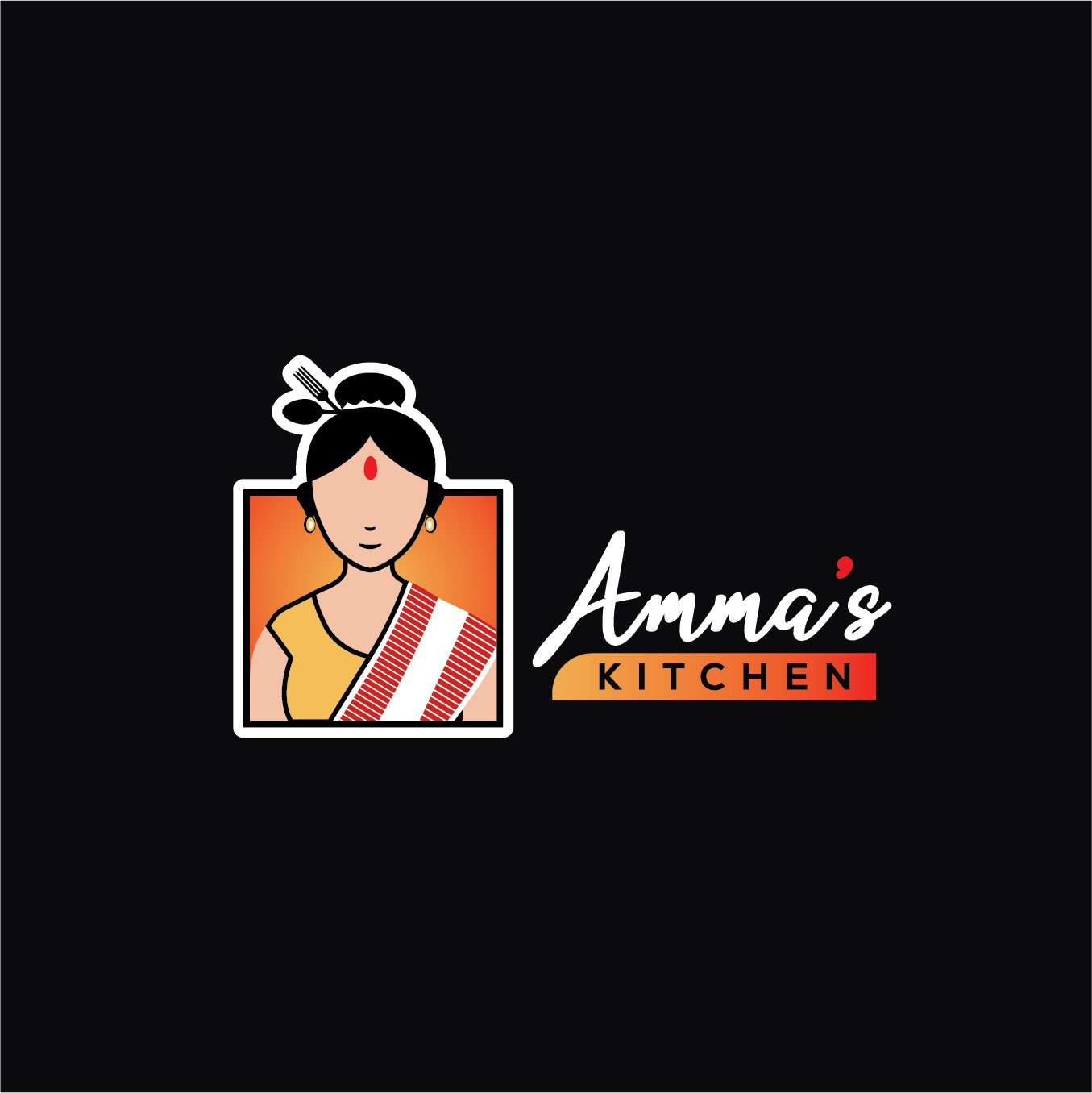
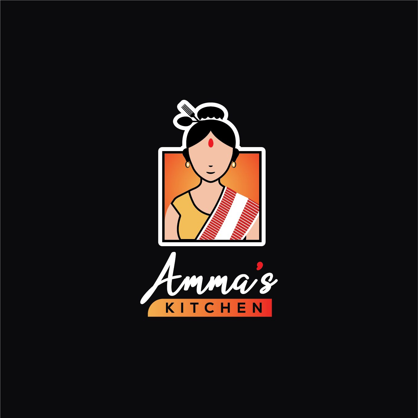
Pieces we produced for real clients. Never stock, never a template.

What's included
- Discovery — business, audience, competitors, positioning
- Moodboards and creative direction
- Logo concepts, typically two to three directions
- Full development of the chosen direction
- Logo variations — horizontal, stacked, icon, single colour
- Typography system with licensed or open-source faces
- Colour palette specified for print and screen
- Brand guidelines document
- Stationery design — card, letterhead, envelope
- Social media profile and cover assets
- All source files in vector format
How we work
- 01 Discovery Your business, your customers, your competitors, and what you need the brand to signal. This shapes everything after it.
- 02 Direction Moodboards and written creative direction, agreed before design begins, so we are not guessing at taste.
- 03 Concepts Two to three distinct logo directions, presented in context rather than floating on white.
- 04 Refine & build the system The chosen mark refined, then extended into typography, colour, variations and applications.
- 05 Guidelines & handover A guidelines document anyone can follow, plus every source file in vector format.
What you receive
- Primary logo in vector format
- Horizontal, stacked and icon-only variations
- Single-colour and reversed versions
- Favicon and app icon exports
- Complete colour palette — HEX, RGB, CMYK, Pantone
- Typography system and licensing notes
- Brand guidelines PDF
- Stationery designs
- Social media profile assets
- All editable source files
Why choose us for this
Tested in the real world
We print and build. Your logo is checked at business-card size and on a hoarding before sign-off.
A system, not a picture
You get the rules that keep it consistent long after we have handed over.
Honest about rebrands
If your existing equity is worth keeping, we will say so rather than sell you a bigger project.
You own the vectors
Every source file is yours. Any designer, anywhere, can pick it up.
Explore in detail
Questions people ask
How long does a full identity take?
Three to five weeks for a complete identity with guidelines. A logo alone can be faster, but we usually advise against buying just a logo.
How many concepts will I see?
Two to three genuinely distinct directions. Presenting twenty options usually means the brief was not understood.
What if I do not like any of them?
That is almost always a brief problem, so we go back to discovery rather than to the drawing board. It is why we agree written creative direction before designing.
Do I own the logo?
Completely, on final payment — including all vector source files and full commercial rights.
Should I rebrand or refresh?
If customers recognise you, refresh. If your brand actively misrepresents what you now do, rebrand. We will give you a straight opinion after discovery.
Will the fonts cost extra?
We default to high-quality open-source typefaces with no licensing cost. If a commercial face is genuinely better for you, we will say so and you decide.
Can you match my logo across print and web?
Yes — that is the point of the colour system. We specify print and screen values separately so they look like the same colour in both.
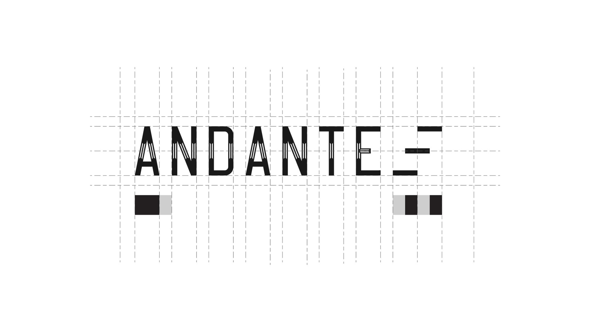
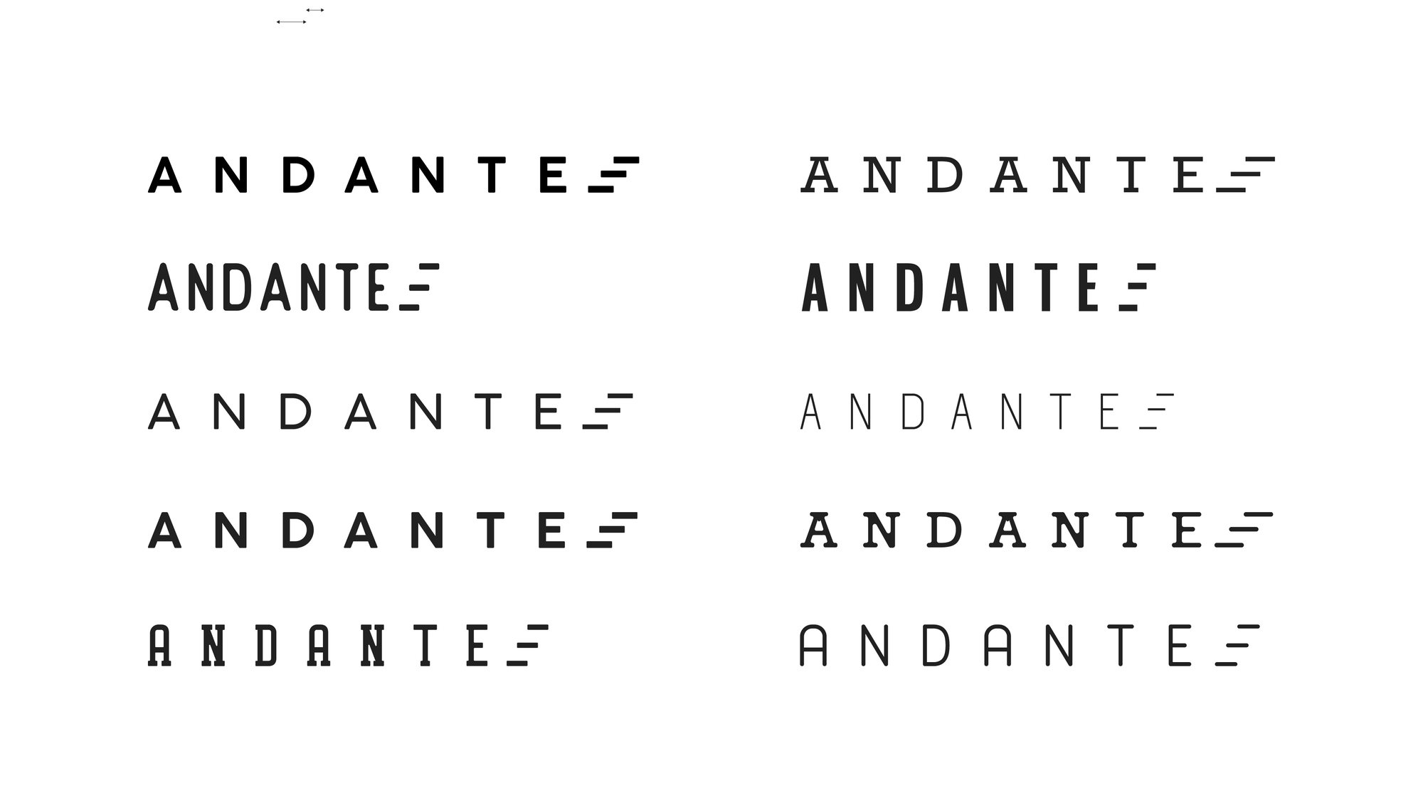
How a mark is made
Nobody draws a logo freehand.
It is built on a grid, so the spacing between the A and the N is the same relationship as the spacing between the T and the E. That is the difference between a mark that looks right at any size and one that only looks right at the size it was drawn.
Then it gets tested — weights, widths, spacing, and what survives when you take the colour away.
Redesigns
The mark on the left is what walked in the door.
A rebrand is not a fresh start. The job is to keep whatever recognition the old mark earned and throw away the rest.
-
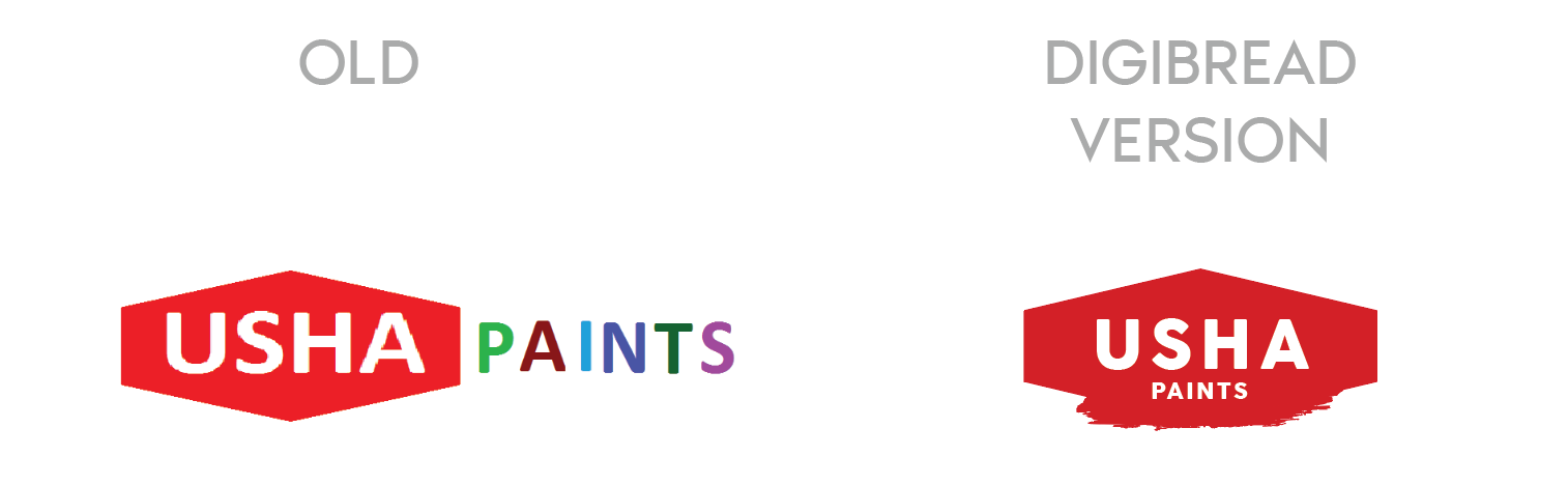
USHA Paints
The old mark had two competing weights and no shape of its own. The redesign keeps the equity in the name and gives it a container that survives being stencilled on a tin.
-
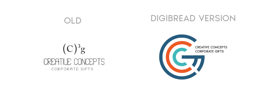
Creative Concepts
A typed superscript replaced with a drawn monogram — the same two letters, but now something that can be embroidered, embossed and read at 12mm.
-
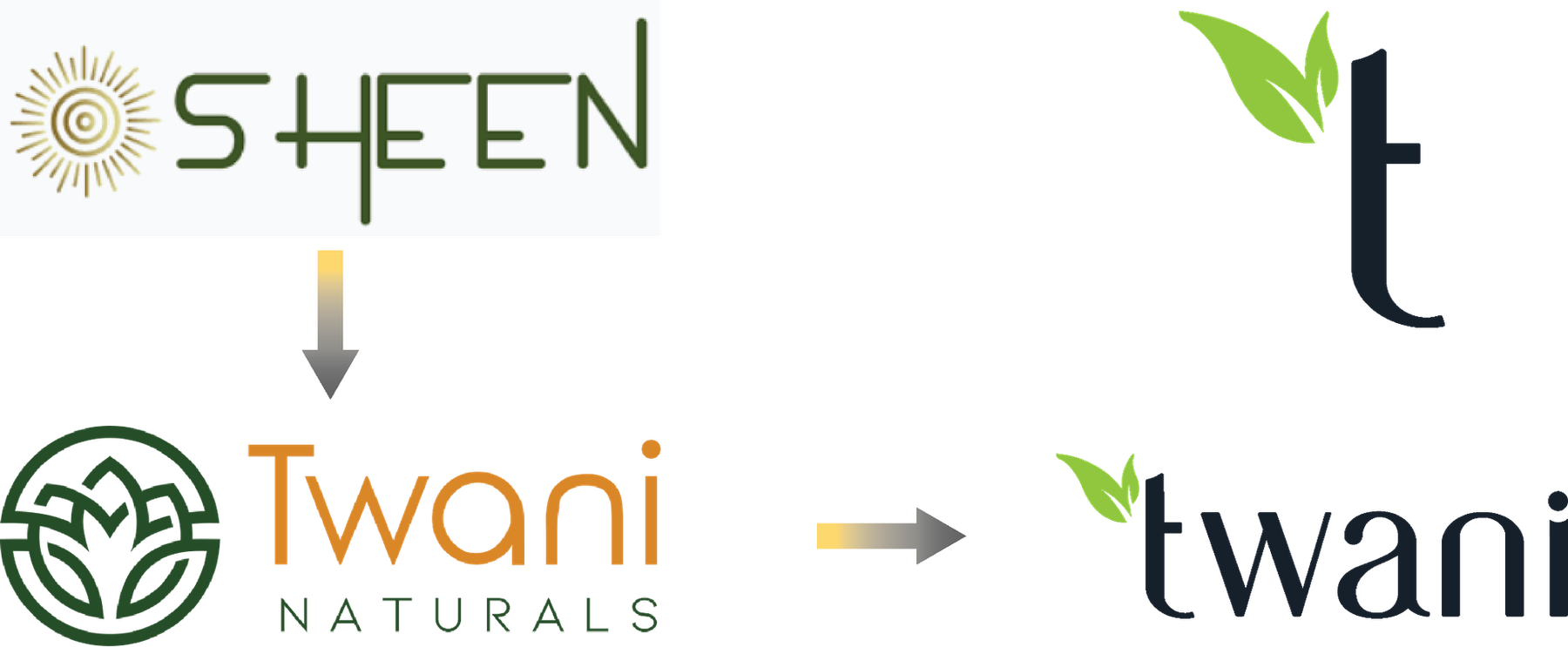
SHEEN to Twani
A full rename, in two moves. The leaf that was decoration in the middle version becomes the stem of the t in the final one.
One brand, sixteen answers
You see one logo. There were fifteen others.
Presenting a single option is a way of hiding the work. Every route below was drawn properly, set on four different grounds, and shown side by side — because the only way to know a mark is right is to see what it beat.
-
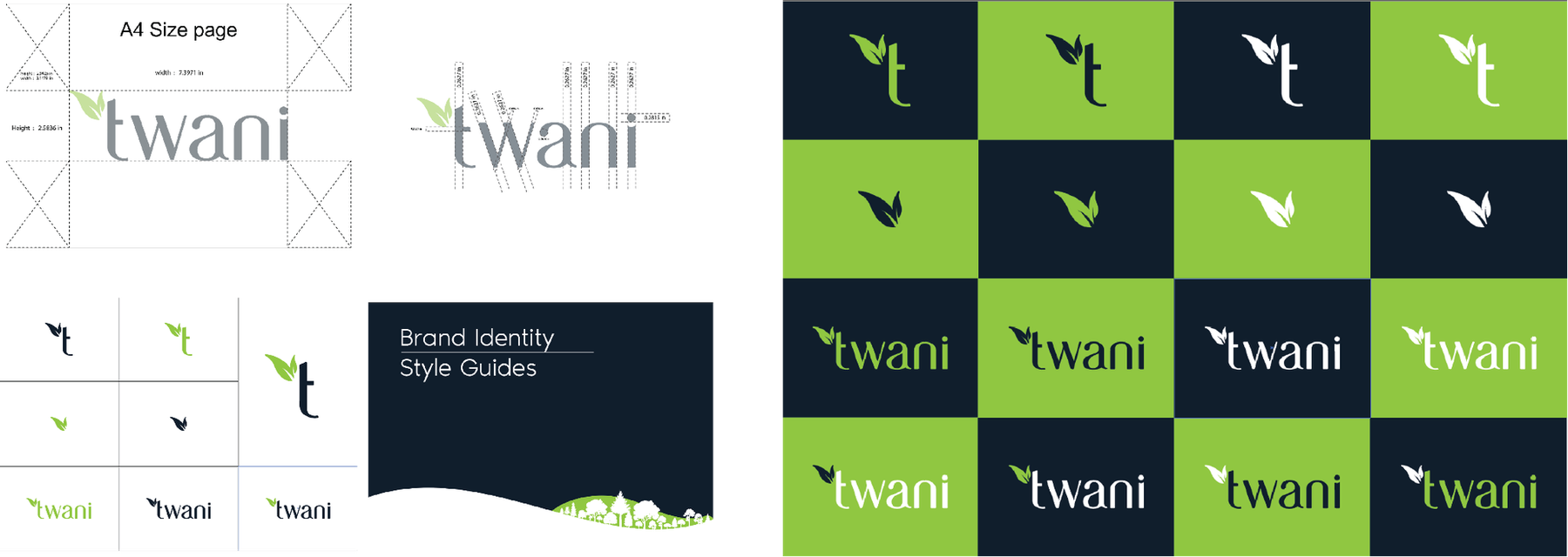
Four families, sixteen routes -
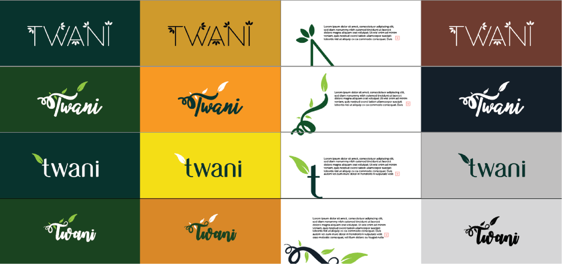
Each one tested on four grounds -
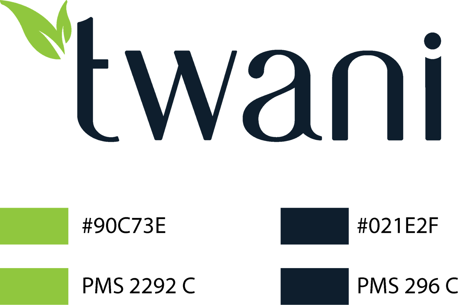
The chosen mark, specified in Pantone
The wall
Marks we have drawn or rebuilt.
27 of them