360° branding & advertising
A logo is the first hour
of a much longer job.
Four brands below, each followed the whole way — the mark, what got printed, what went up on the road, and what got posted. Pick a client and you get their chain only. Nothing here is borrowed from another brand to fill a gap.
- 4
- brands, followed end to end
- 25
- stages between them
- 55
- pieces actually produced
- 0
- stock images in any of it
Natural personal care
Twani
A renamed brand taken all the way to packaging, a product range, a storefront and a reported ad spend — the longest chain we have run end to end.
9 stages
Where it started
It was called SHEEN. Nobody could remember it.
Two renames and a redrawn mark later, it is Twani — and the leaf in the t is doing the work the old logo asked words to do.

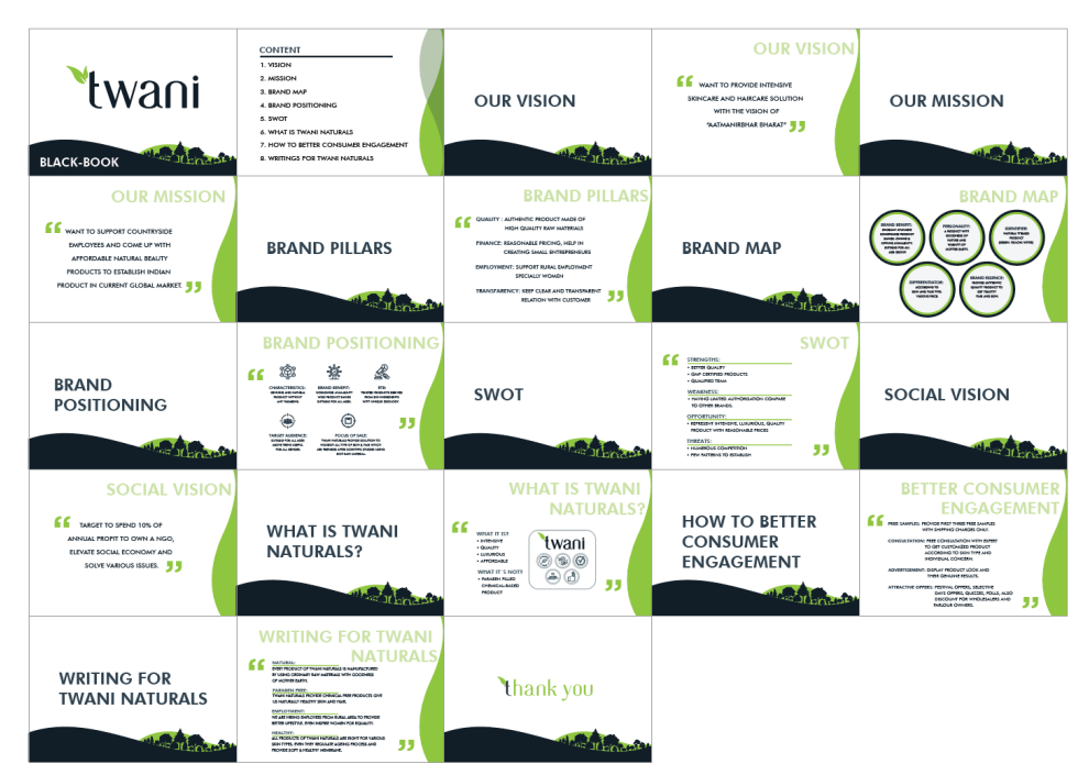
Strategy
Decide what the brand is before drawing anything.
Brand pillars, a brand map, the vision and the tone of voice, written down and agreed. This is the document every later decision gets checked against, and it is why the packaging and the Instagram grid did not end up sounding like two different companies.
- Brand pillars and positioning
- Vision, mission and social vision
- Tone of voice, written as rules
- Who the customer actually is
The mark
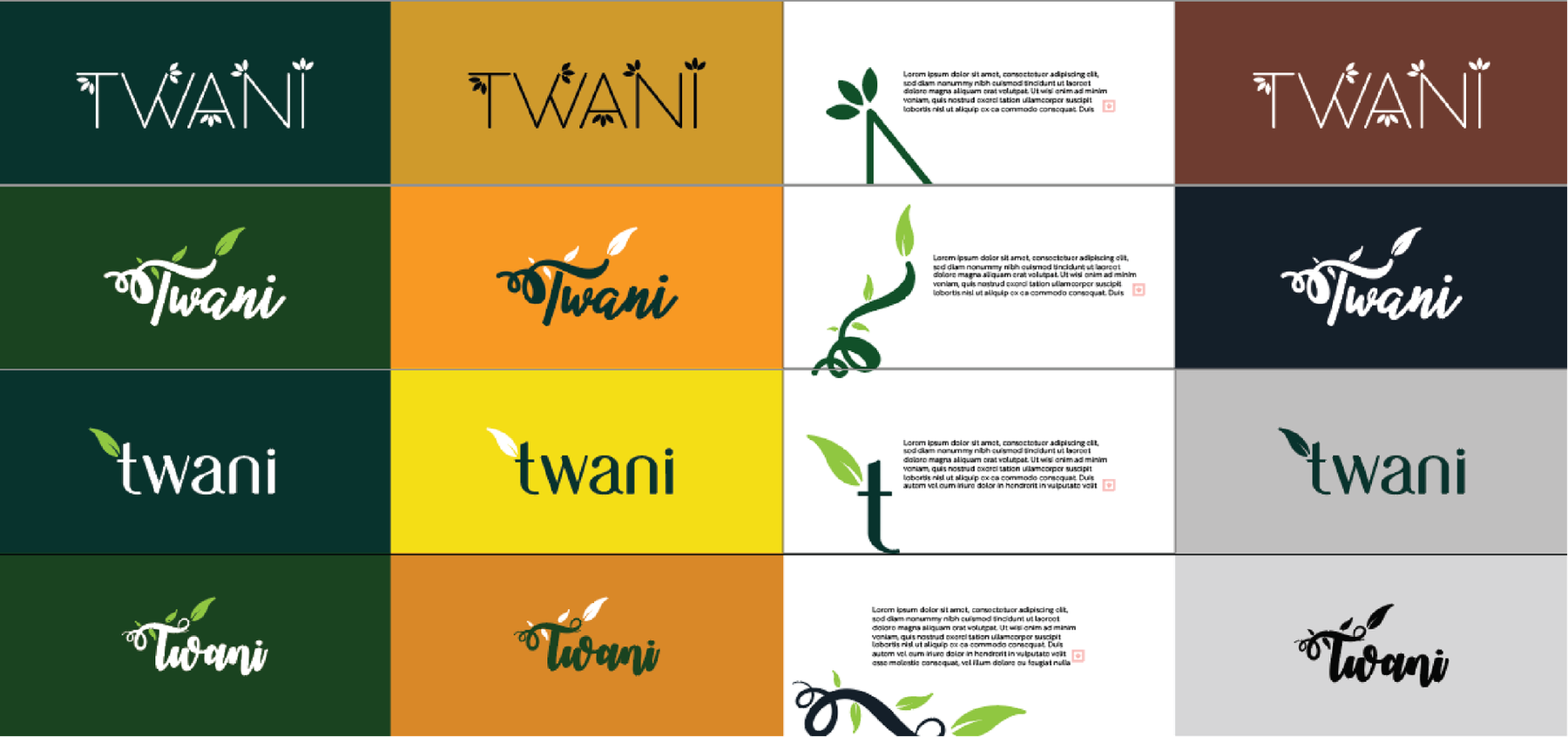
Sixteen versions, to arrive at one.
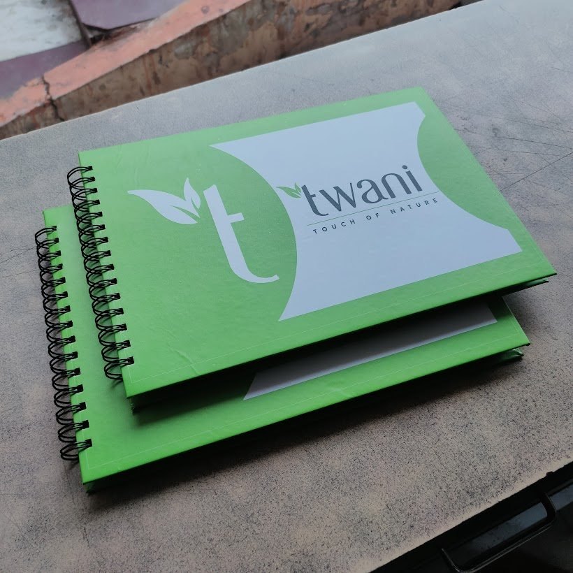
Four families were drawn: an architectural capital, a script, a lowercase humanist, and a monogram built from the leaf. Each was tested on deep green, ochre, white and near-black, because a mark that only works on white is a mark that fails on the first delivery van.
-
The routes, side by side -
Every version on the grounds it has to survive -

Two colours, locked to Pantone
The rules
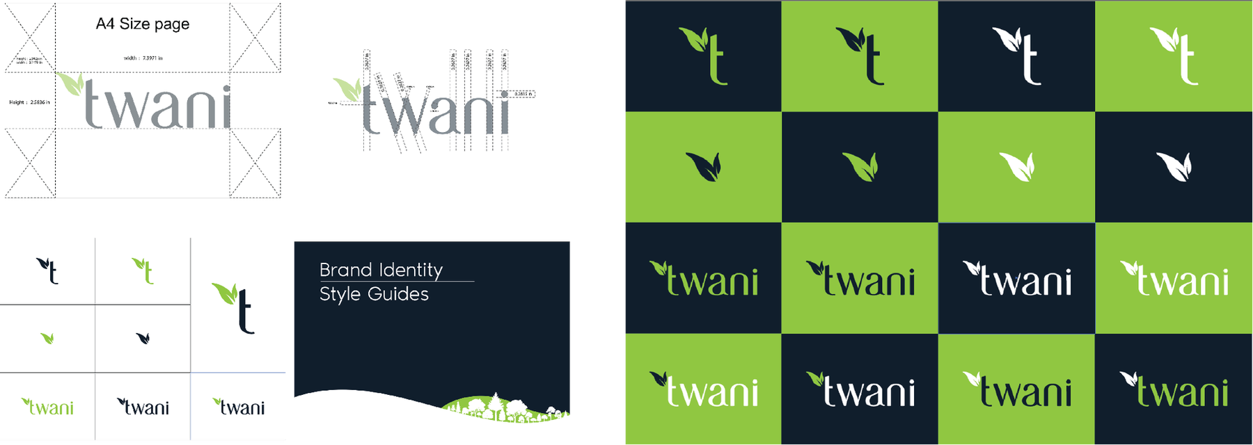
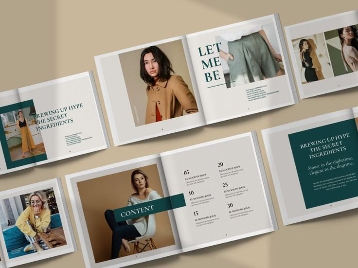
A brand book, so it survives people who were not in the room.
Clear space, minimum sizes, what is not allowed. Printed and handed over, because the person who lays out your next flyer will not be us, and the mark has to hold up when they do it.
- Clear space and minimum size
- Approved and forbidden uses
- Colour in Pantone, CMYK and hex
- Typography with real substitutes
Packaging
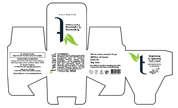
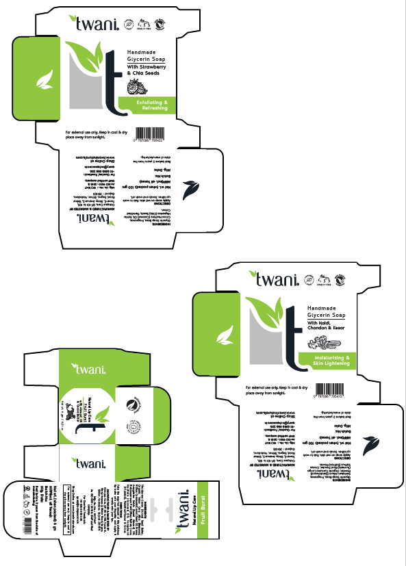
A dieline is not a picture. It has to fold.
Every carton drawn flat, with the fold lines, the glue flaps, the batch panel and the statutory text in the places the law puts them. Approved on screen, then proofed on the actual board before the run.
-
The carton, flat -
The range, drawn as one system -
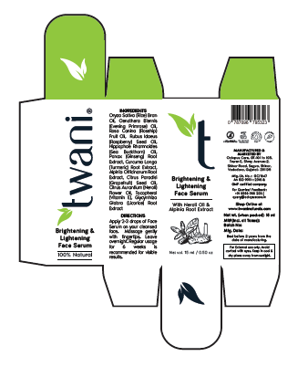
Serum carton
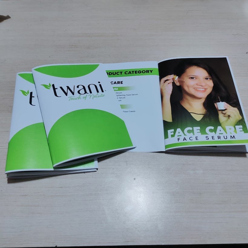
The product
Then it becomes a thing on a shelf.
The point at which a brand stops being a document. The same system across every SKU, so a customer who picks up the hair oil recognises the face cream beside it.
-

The full range -

Hair oil, cartoned -

One system across every SKU -

Serum
Photography
Shot for the feed, not borrowed from a stock library.
A real person holding the real product, lit and framed for the crop the platform will apply. Stock would have been cheaper and it would have looked like every other brand in the category.
-
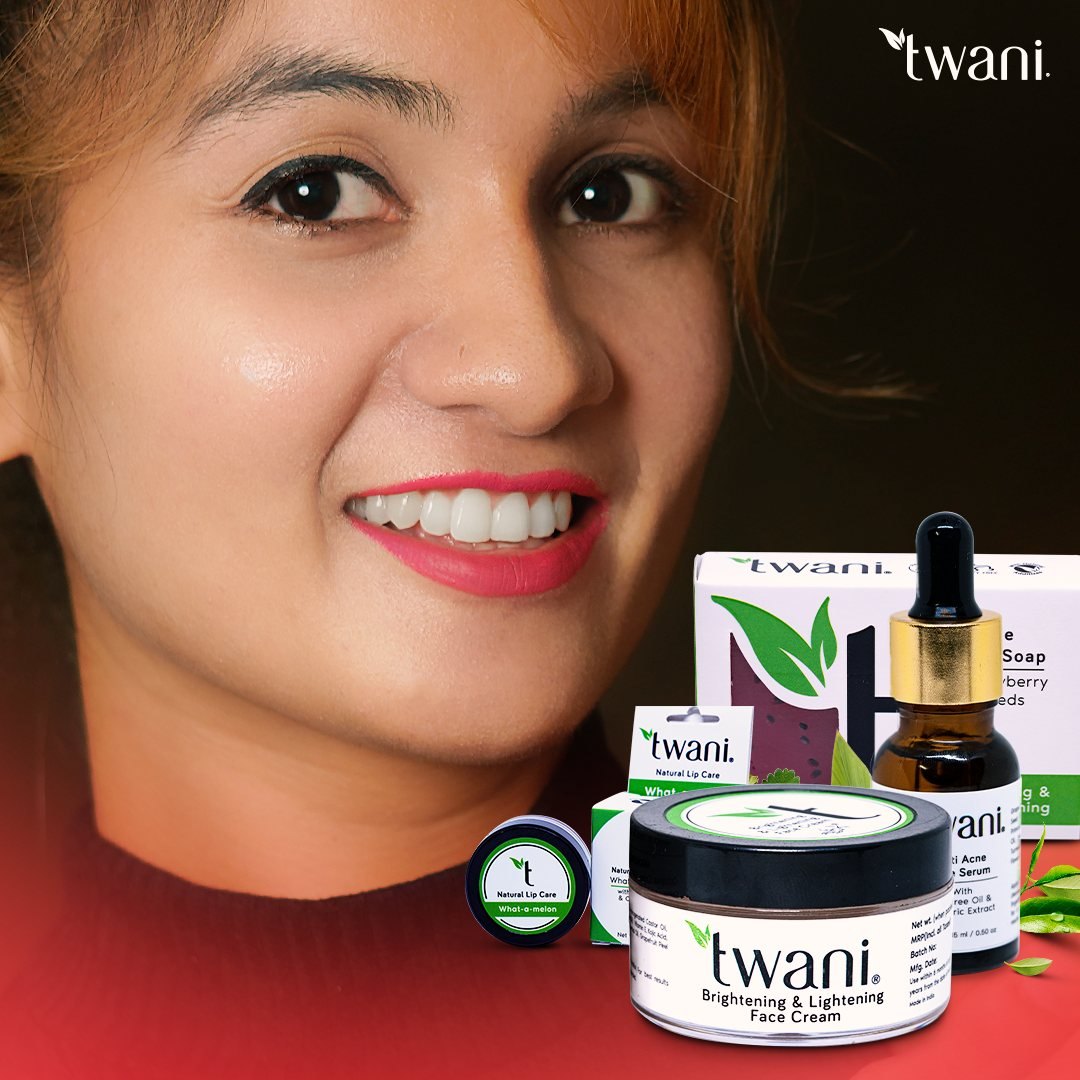
Campaign photography -
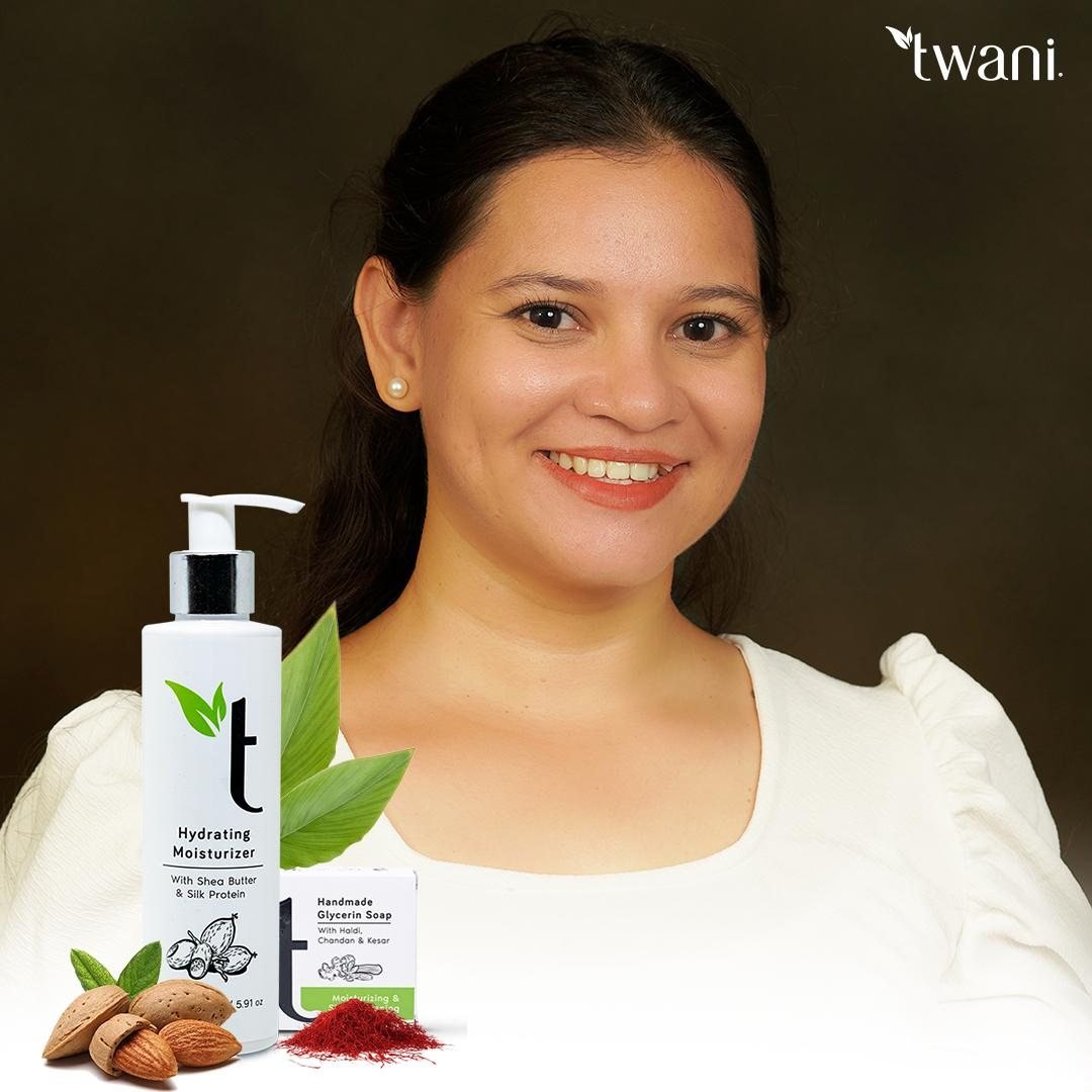
Shot for the grid -
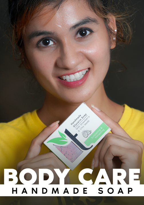
Body care -

Hair care
Where it sells
A shop, a marketplace and a grid.
The same identity carried onto an own-site storefront, an Amazon listing and an Instagram profile — three very different sets of rules, one brand that still reads as itself in all of them.
-
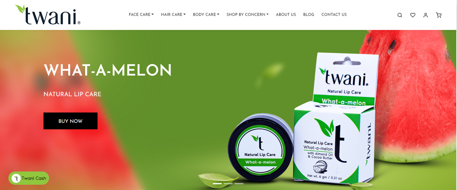
The storefront -
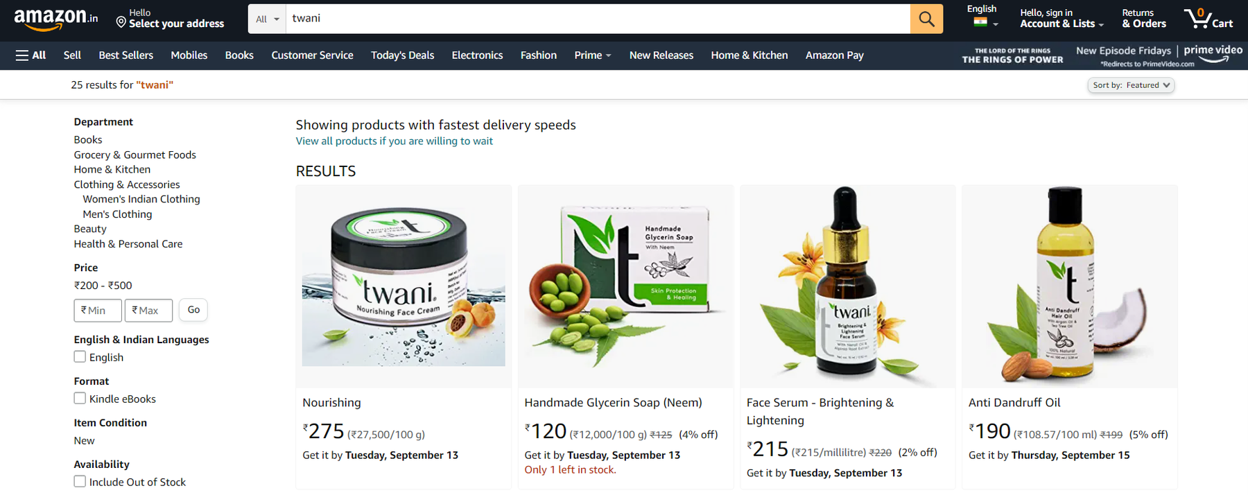
The marketplace listing -
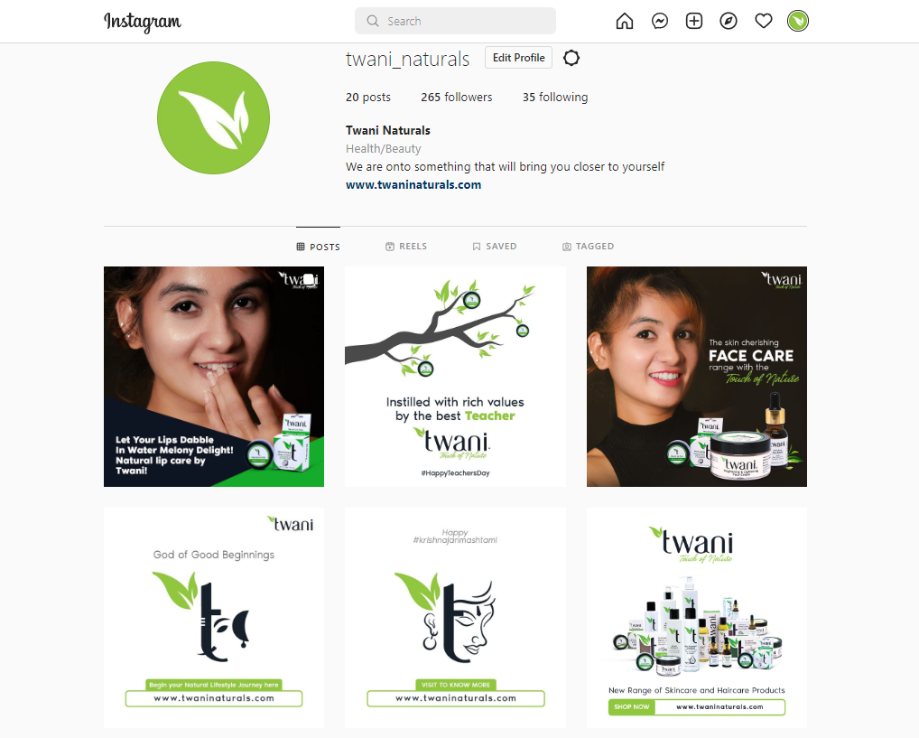
The grid
The spend
Campaigns that report what they cost.
Ads built from the same photography, reported against what they actually returned rather than against impressions.
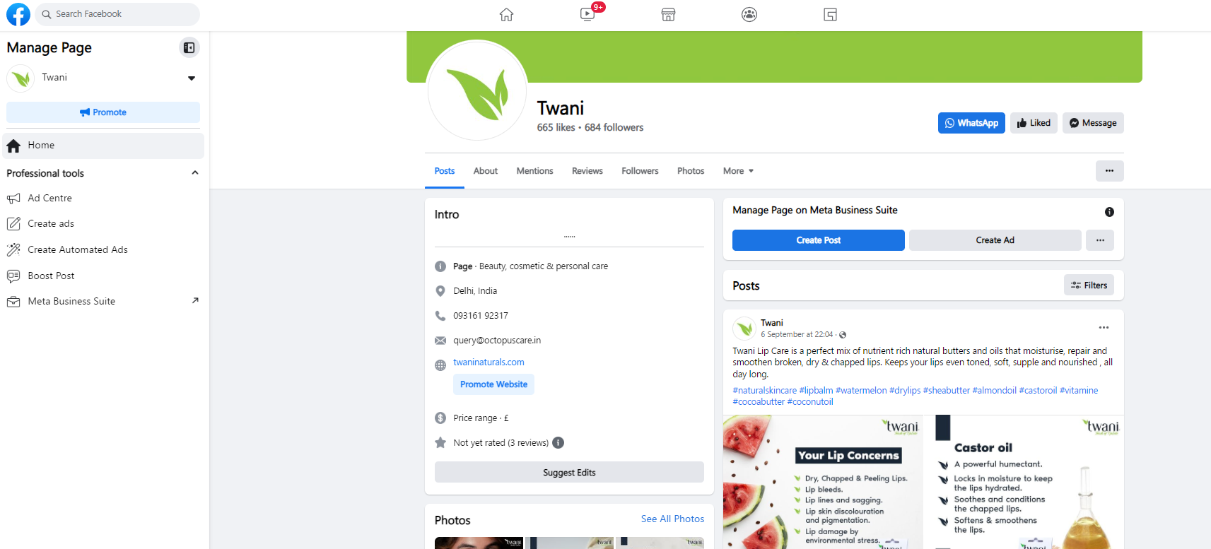
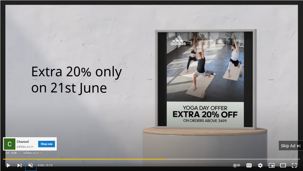
Offline
And then it goes outside.
Newspaper insertions and signage at the door. Digital gets a brand found; this is what makes people believe it is real.
-
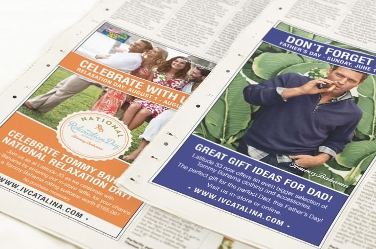
Newspaper insertions -
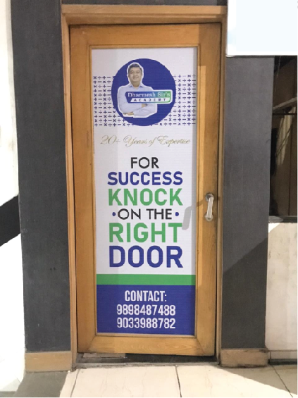
Signage at the door
Coaching academy, Vadodara
Dharmesh Sir’s Academy
A tutor with a local reputation and no brand around it. Built the mark, the promise, and the whole admissions season — printed, postered, hoarded and posted.
7 stages
The mark
A rebuild, not a redraw.
The old mark could not hold at the sizes it had to live at — a hoarding on Old Padra Road and a WhatsApp display picture are three orders of magnitude apart. The new one is built to survive both.
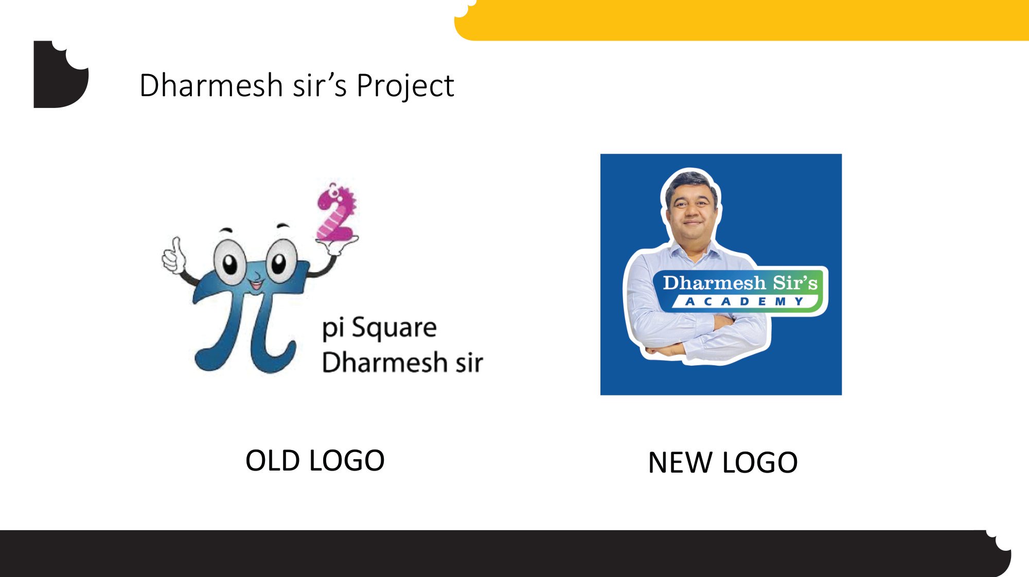
Tagline and theme
Say the thing the parents already say about him.
Tutor of most school toppers in Vadodara. Not invented — it is what word of mouth was already carrying, written down and made repeatable so every piece says the same sentence.
-

The theme, applied -

The founder, cut out for every later piece
Printables
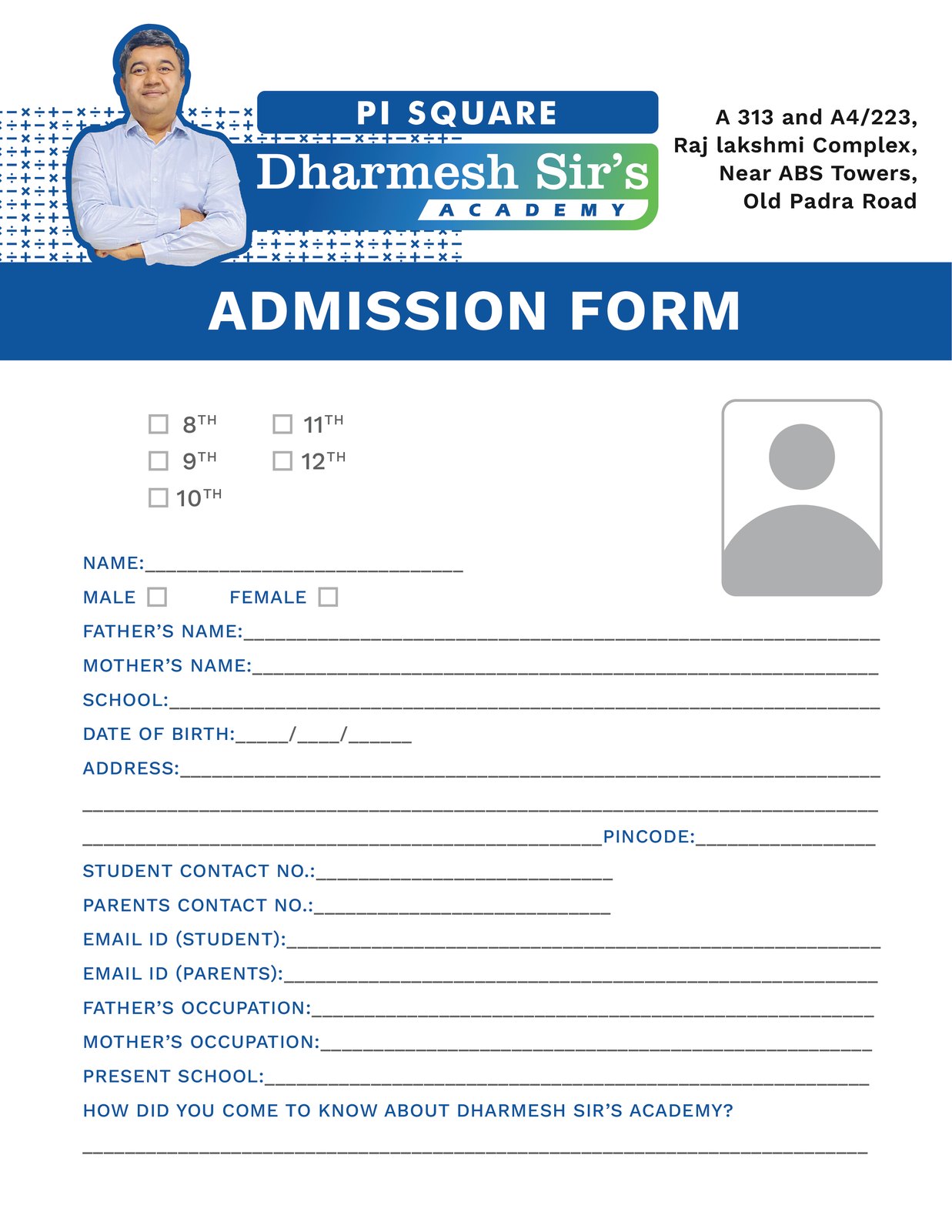
The form a parent actually fills in.
An admission form is the least glamorous thing in a brand system and the one a parent spends the longest looking at. Set properly, printed properly.
Flyers
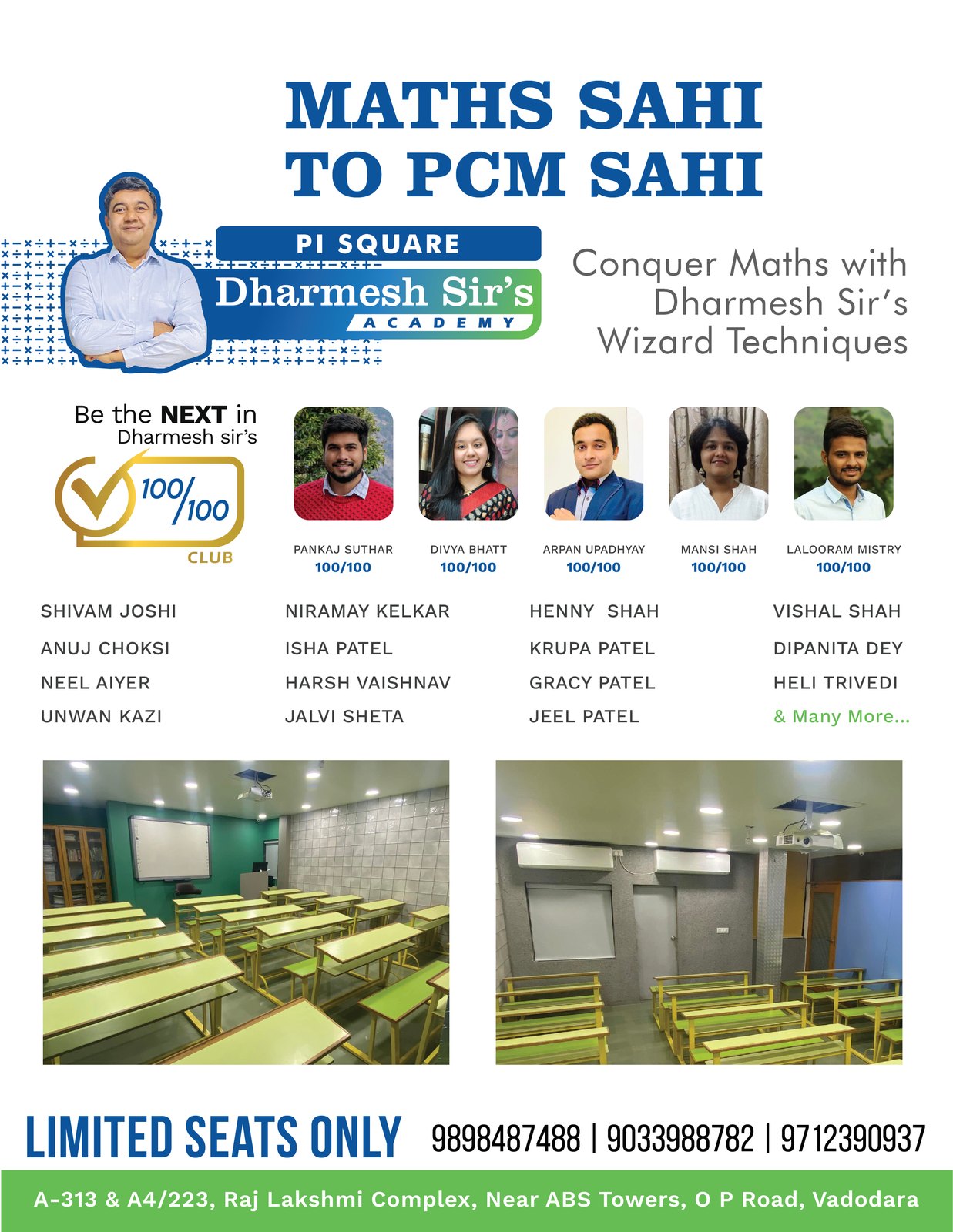
Two offers, two audiences, one identity.
Separate pieces for the board students and for the maths-to-PCM route, carrying real results and real faces rather than a stock classroom.
-

School toppers flyer -
Maths to PCM
At the door
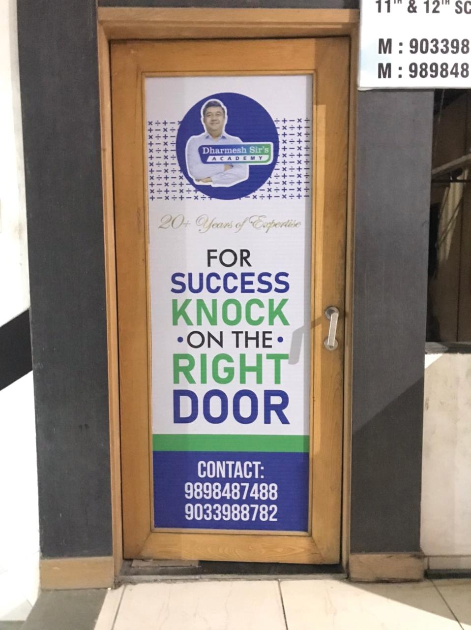
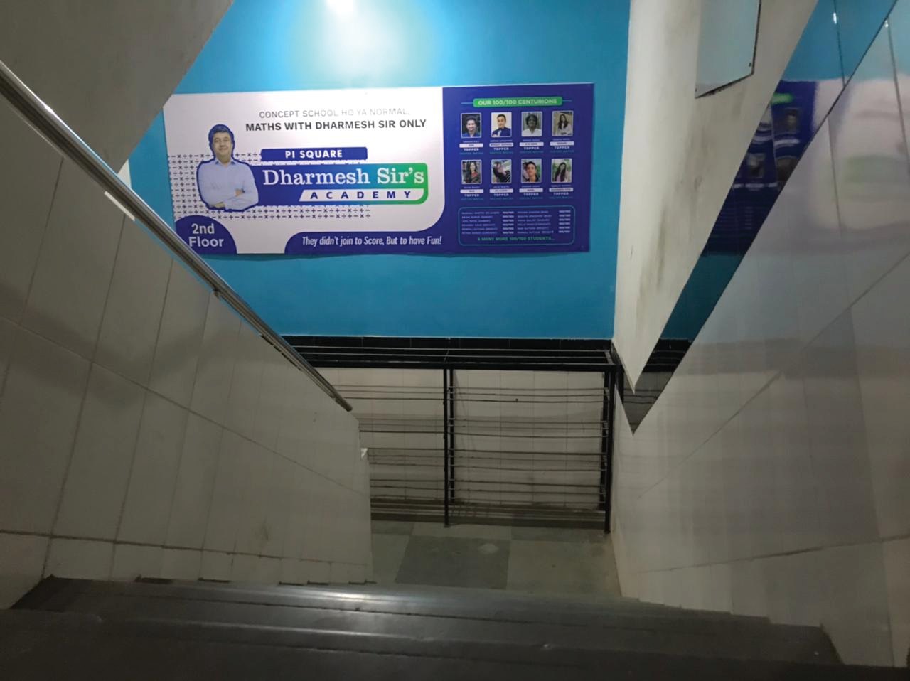
The building has to say it too.
Door signage and stairwell branding, so a parent who has climbed two floors knows they are in the right place before anybody greets them.
-
Signage at the door -
The stairwell
Outdoor
Then it goes up over the road.
Hoardings placed where the parents actually drive, sized and set so the promise is readable at speed rather than only close up.
-
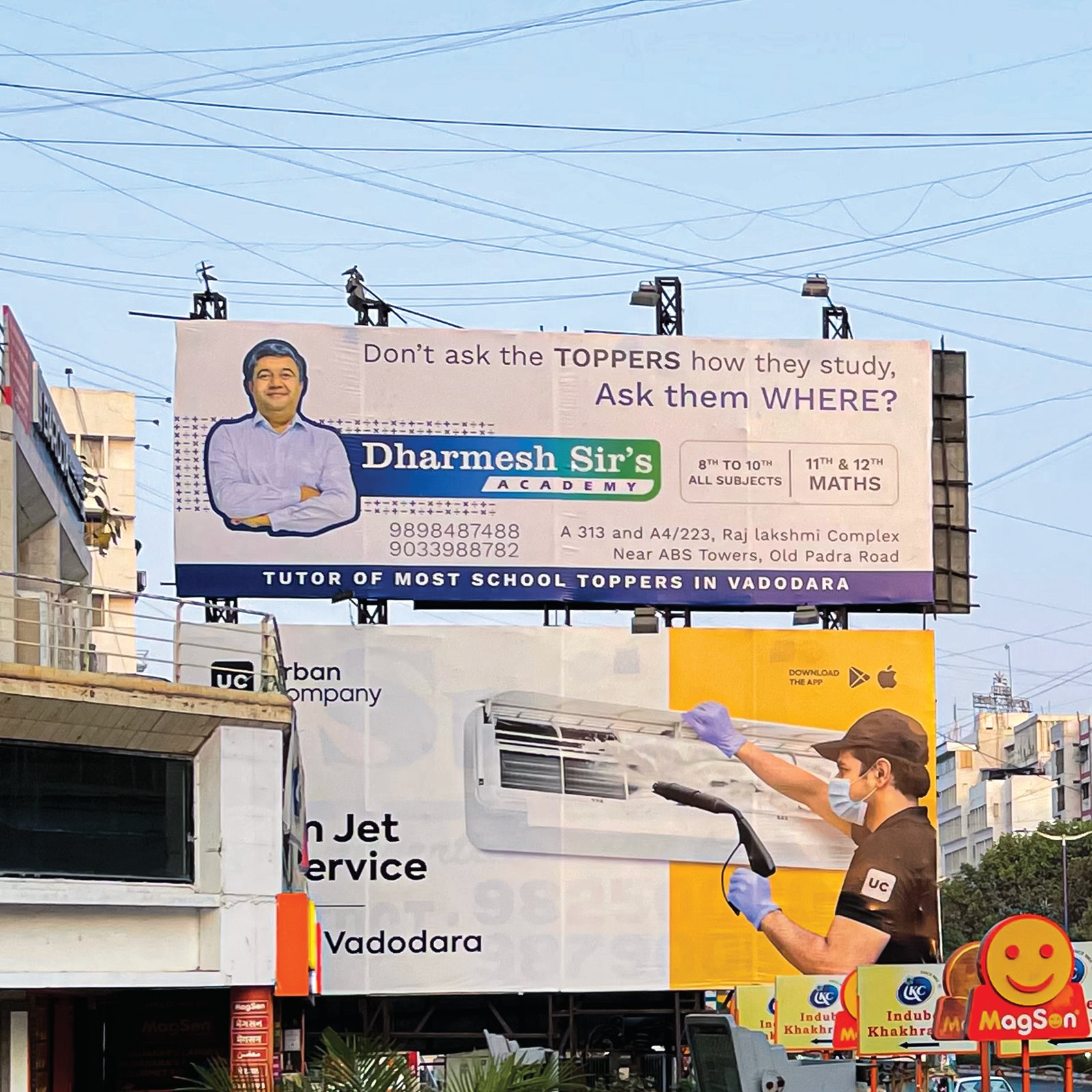
Hoarding, Vadodara -
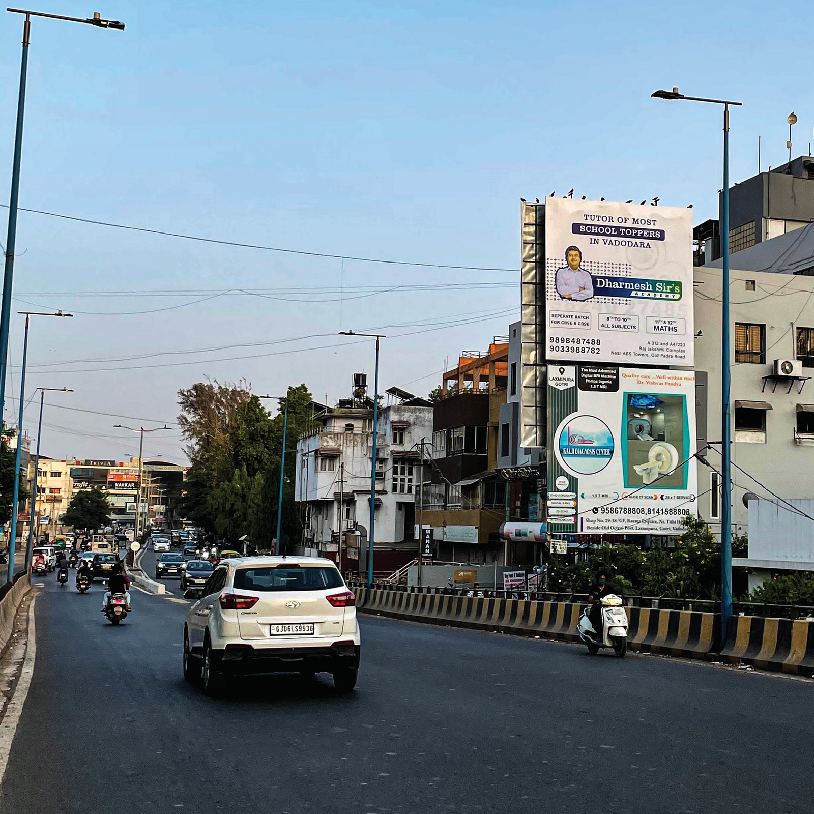
On the flyover approach
Social
And keeps saying it, all season.
A posting run built from the same theme — results, demo classes, batch openings — so the hoarding and the feed are recognisably one campaign.
-

Results -

Demo class offer -

Batch opening
Restaurant, Diwalipura
Amma’s Kitchen
A kitchen opening its doors. Identity, the menus people order from, the cards the team hands over, and the glass they walk past.
5 stages
The mark
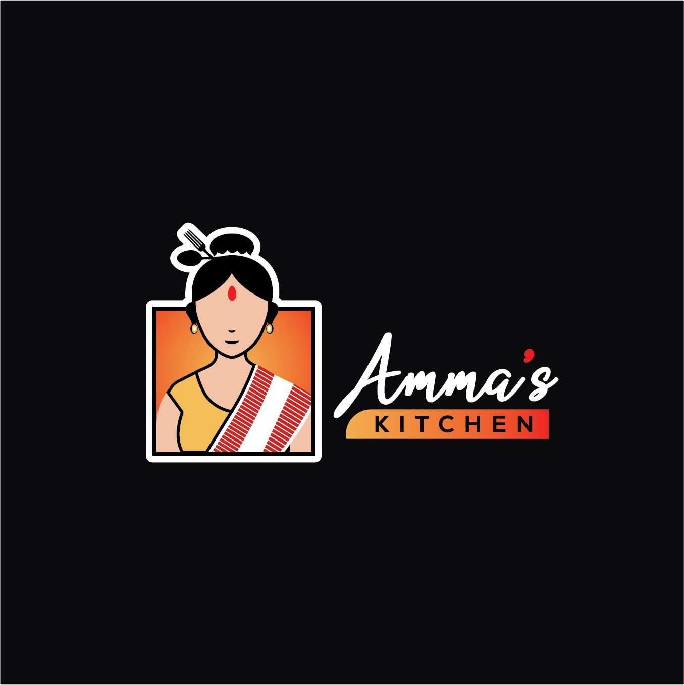
A face, not a monogram.
A restaurant trading on home cooking needs a mark with a person in it. Drawn to work small on a takeaway sticker and large on a shopfront.
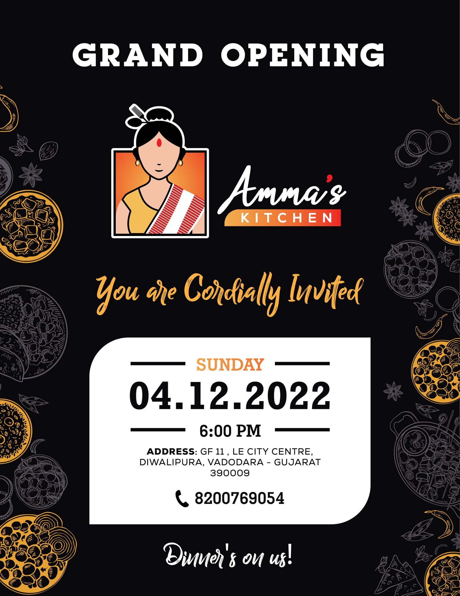
Opening
The invitation that starts the trading.
A grand-opening invite carrying the identity from day one, so the first thing anybody receives already looks like the restaurant they are about to walk into.
The menu
Five menus, one kitchen.
Punjabi, Chinese and South Indian, plus drinks and takeaway — each set so a customer can find a dish in a few seconds under bad light, which is the only test a menu really has.
-
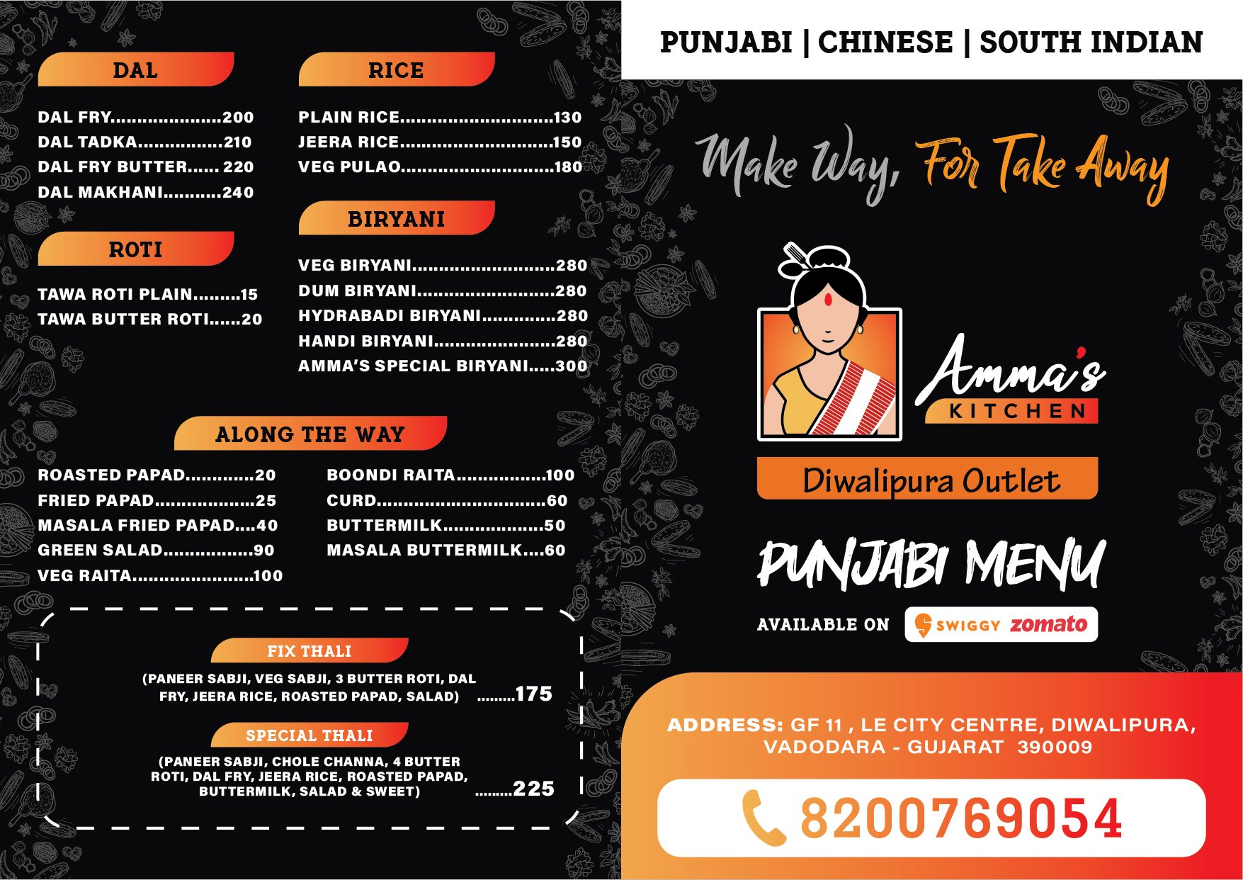
Takeaway menu -
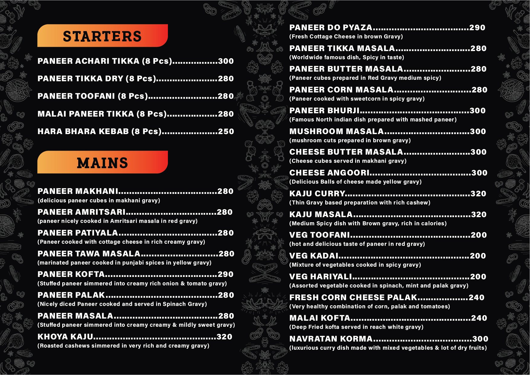
Punjabi -
Mains -
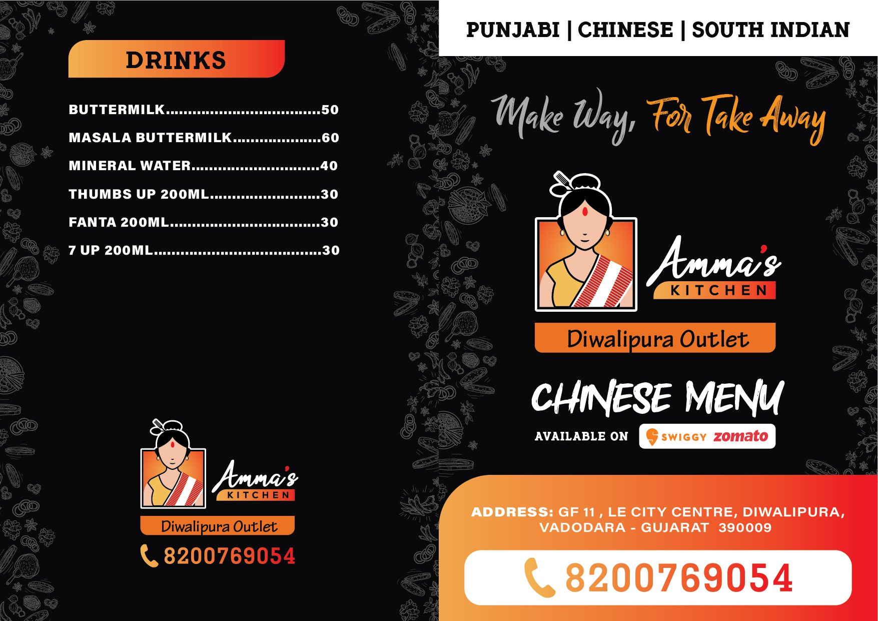
Drinks -
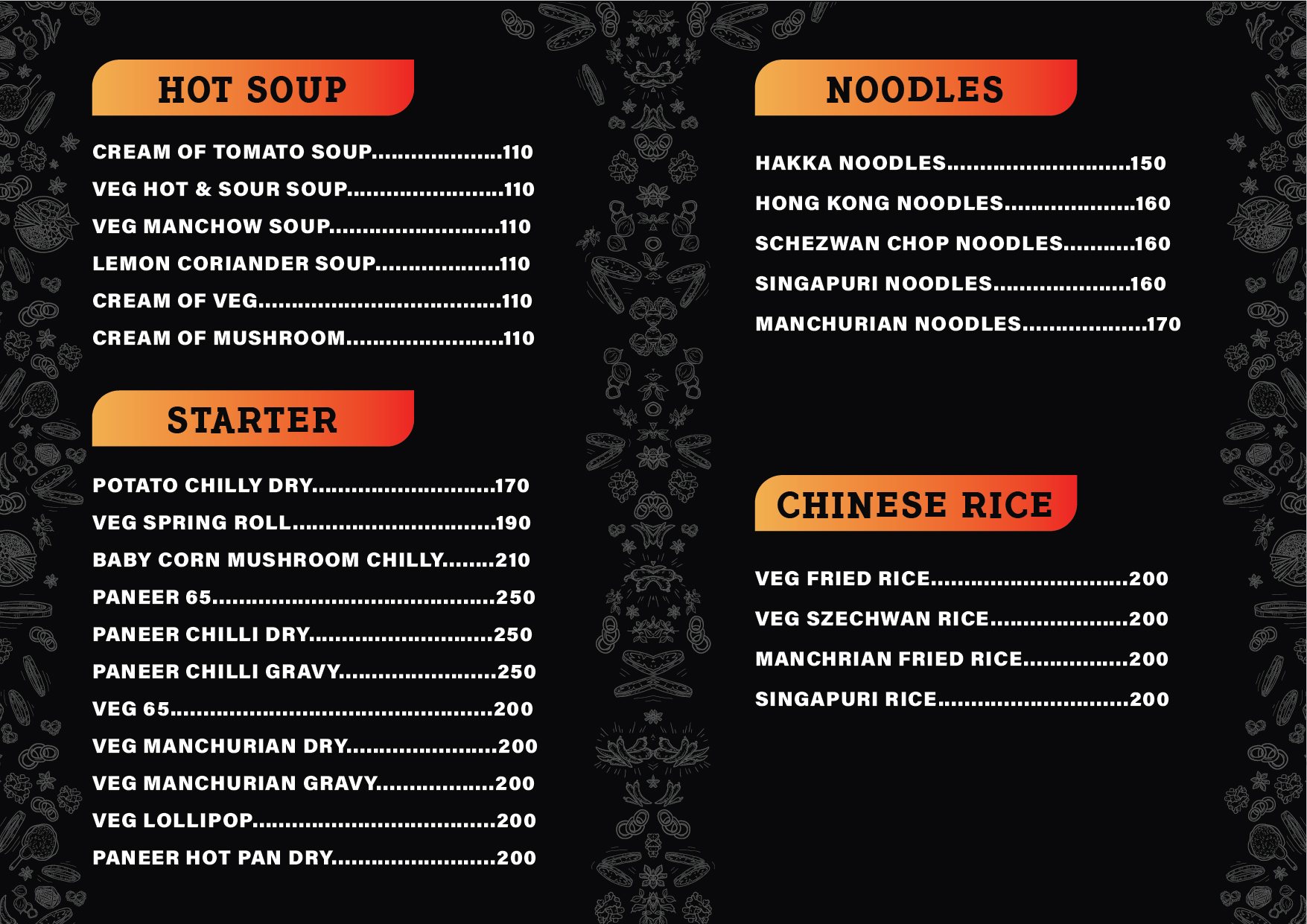
Chinese
Stationery
What the team hands over.
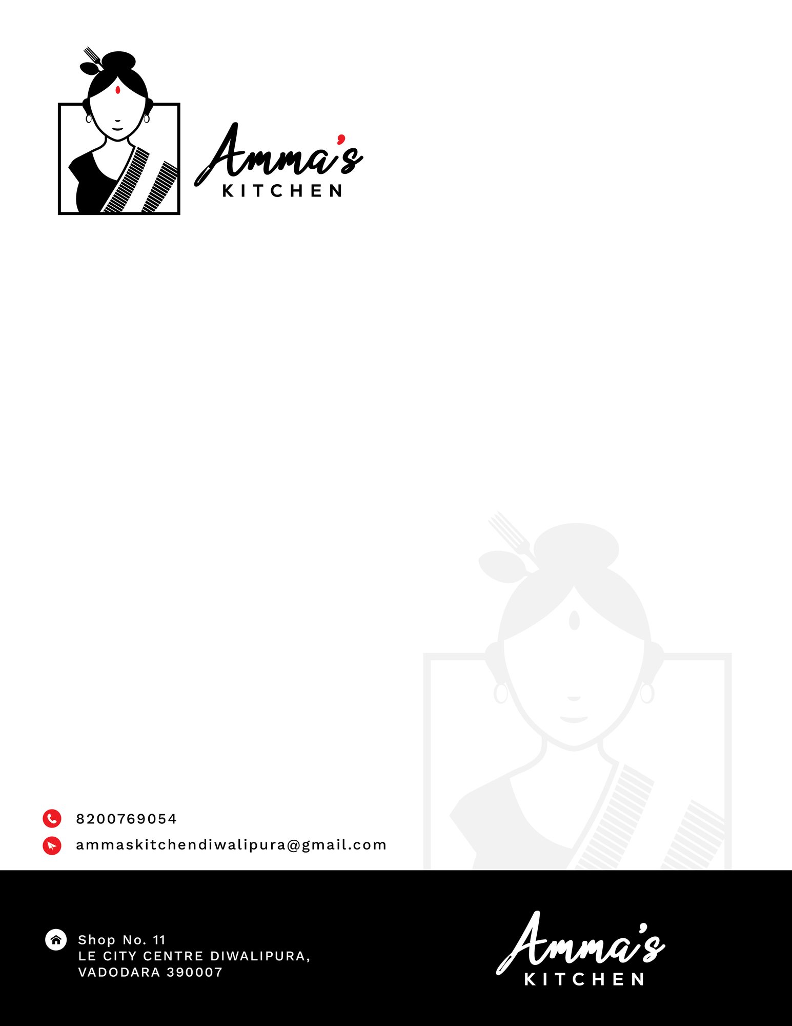
Cards for the director and the outlet manager, and a letterhead for everything that has to go out on paper.
-
Business card -
Business card -
Letterhead
Offline
The glass and the road.
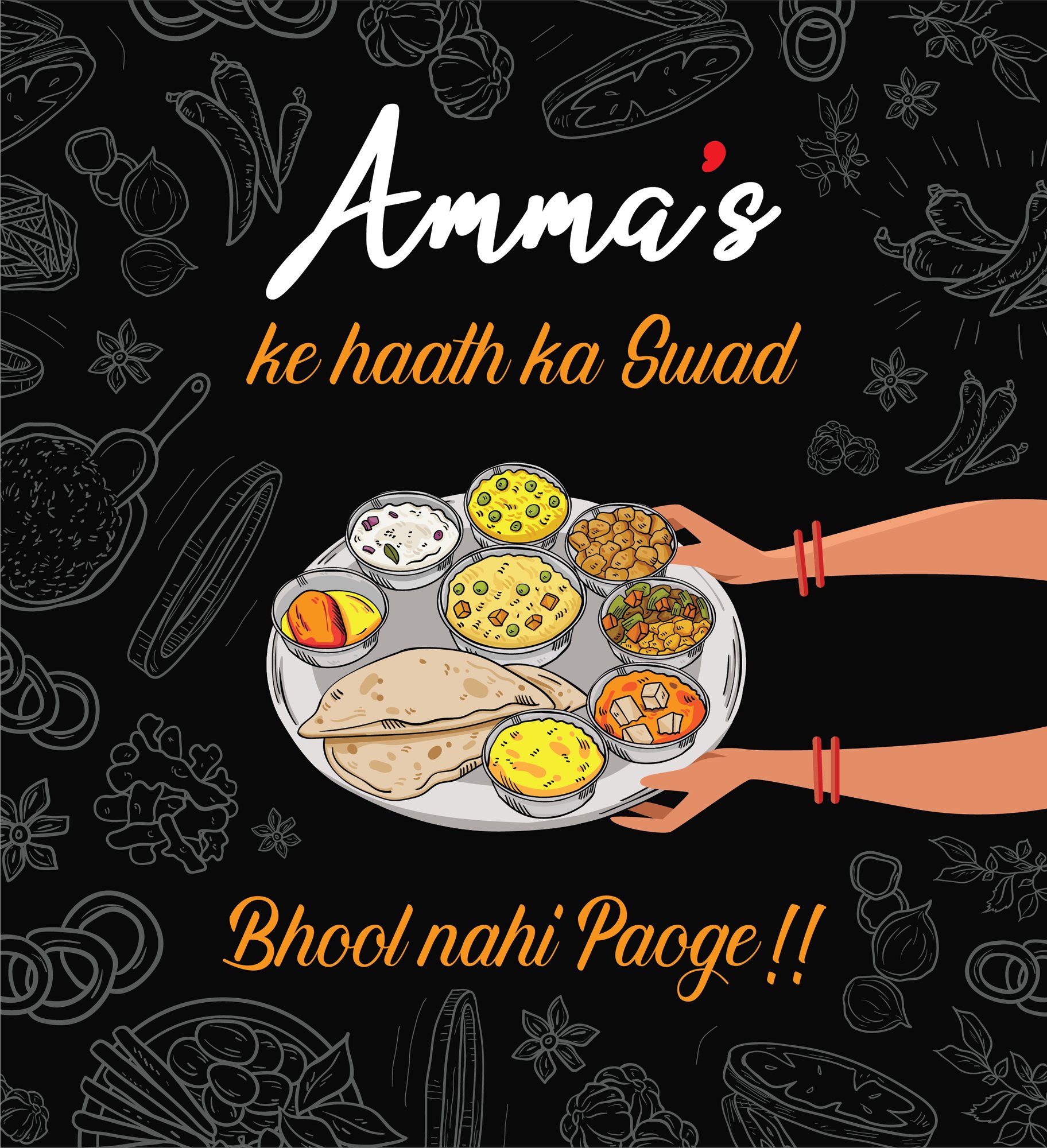
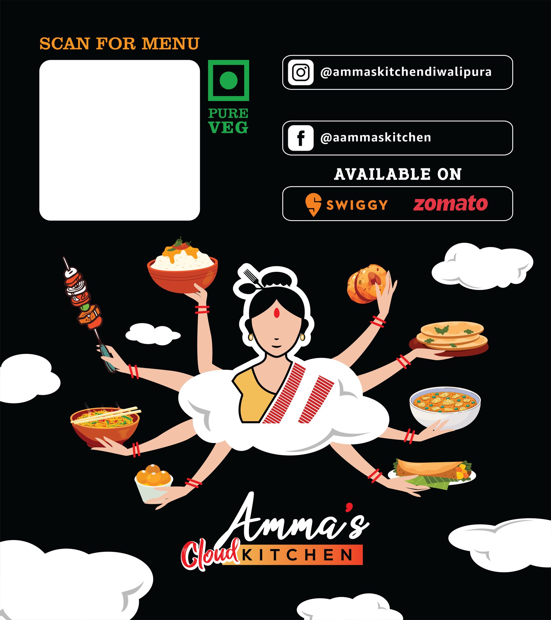
One-way vision on the glass so the room is private from outside and open from inside, and flex outdoors for the trading hours.
-
One-way vision glass -
Outdoor flex
School, Padra
Gitanjali School
An admissions season: the flyer, the prospectus, the hoarding on the Padra road, and the card every student wears.
4 stages
Admissions
The piece that has to reach a parent first.
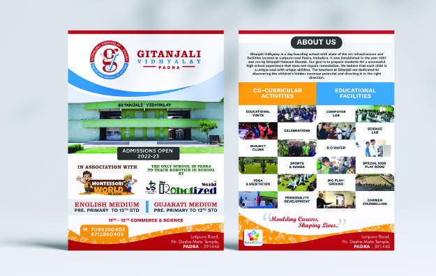
Both mediums of instruction, the fee position and the phone number, on one sheet a parent can act on without needing a second conversation.
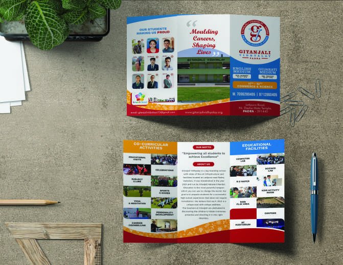
The prospectus
Then the piece they keep.
A tri-fold that survives being carried home in a bag and read at a kitchen table, which is a different design problem from a flyer handed out at a gate.
Outdoor
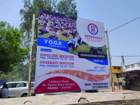
Placed where the catchment actually is.
A hoarding on the Padra road, sized for the distance it is read from rather than for the artwork it was drawn at.
On the student
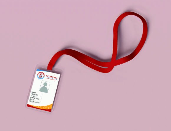
And the piece worn every day.
The identity card and lanyard — the only piece of a school brand that is seen by the whole town, every morning.
Not improvised
Every one of those stages sits on a diagram somebody drew first.
The journey a customer takes, and the route a job takes through the studio. Both were mapped before the first file was opened — which is why the packaging, the shop and the hoarding all look like the same company.
-
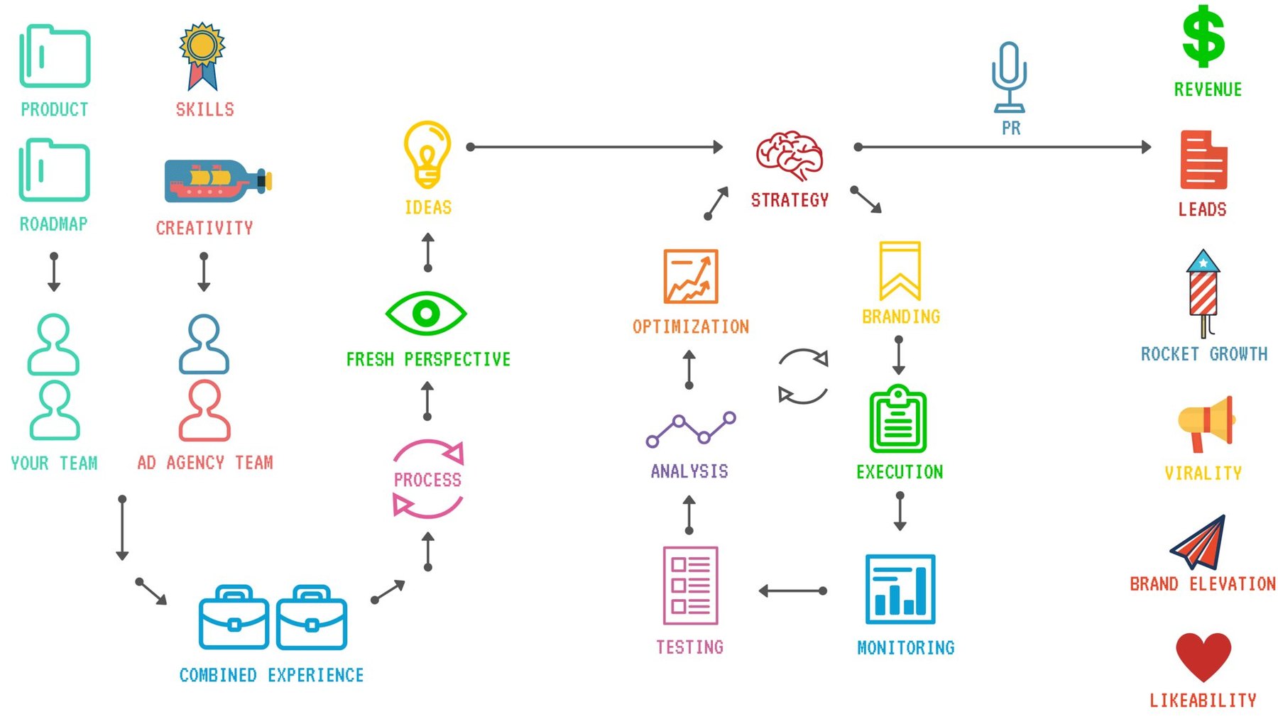
The customer journey the work was built around
-
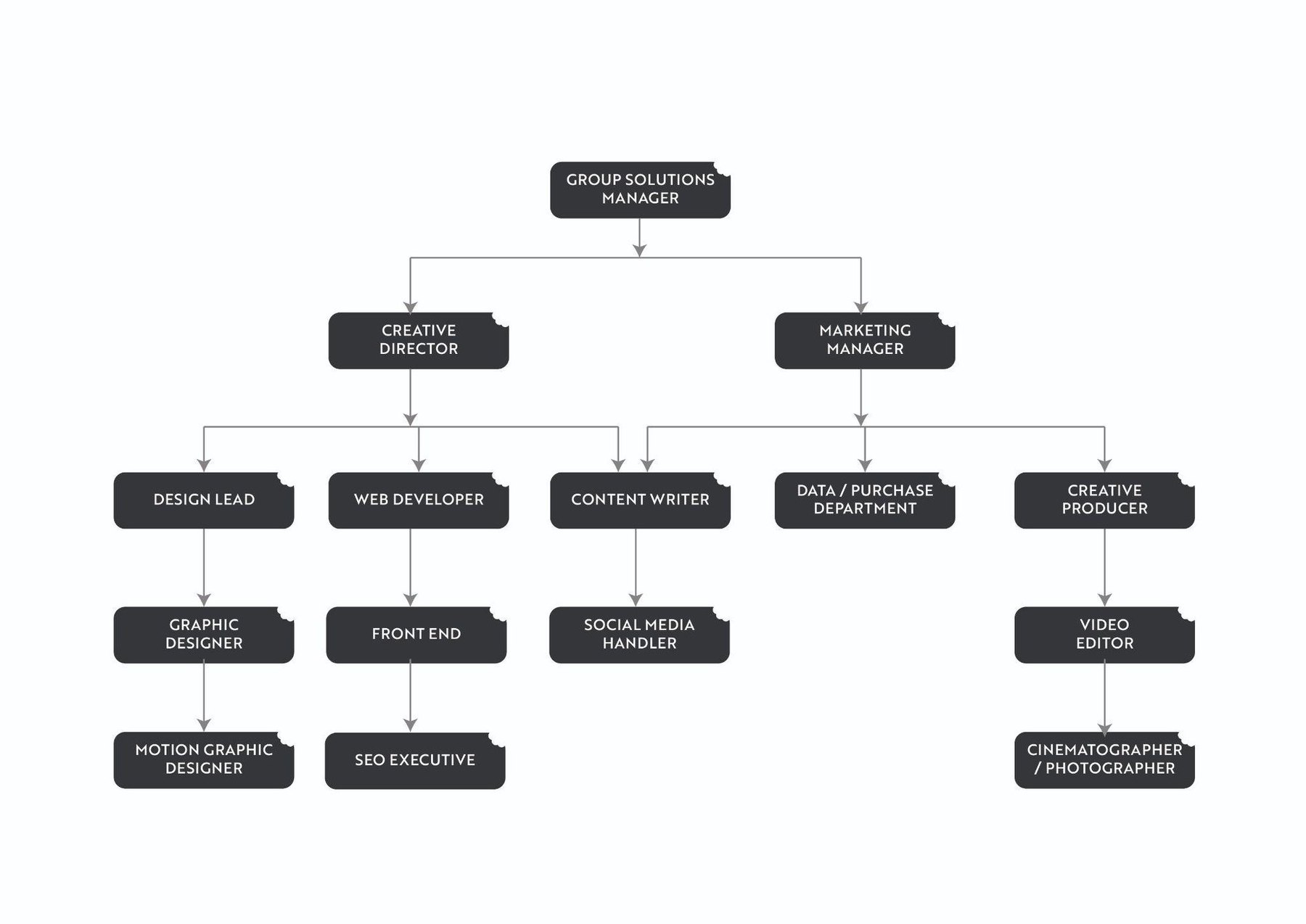
How a job moves through the studio
Which stage are you stuck at?
Most people arrive somewhere in the middle — a logo they have outgrown, packaging that will not print, a shop nobody buys from. Tell us where you are and we will say what we would do first.