Golden Ratio Logo Design
A mark built on a grid, not sketched until it looks about right.
- 2–3 weeks depending on rounds
The golden ratio is 1.618. Put simply, it is a proportion that keeps turning up when things are divided in a way people find balanced, and designers have used it as a construction aid for a very long time.
It will not make a bad idea into a good logo. Nothing does. What it gives you is a mark whose parts relate to each other by a rule rather than by eye — so the curve of a letter, the size of a counter and the space around the whole thing are all derived from the same system instead of being nudged until they looked acceptable on the day.
That matters later rather than on the day you approve it. A mark drawn on a grid can be rebuilt at any size without drifting, described precisely to a printer or a sign maker, and extended into new pieces a year later by somebody who was not in the room. A mark that was nudged into place cannot be, and that is when brands quietly start looking inconsistent.
We construct on the grid, then we break it where the grid is wrong. Geometry is a tool for getting to a defensible mark, not a religion — if a curve needs a quarter of a degree it should not have, it gets it, and we tell you where and why.
What's included
- Golden-ratio construction grid, drawn and kept
- Sixteen routes explored, narrowed to three with you
- Final mark in vector — AI, EPS, SVG, PDF
- Clear-space and minimum-size rules derived from the grid
- Legibility tested down to 12 mm and at favicon size
- Set on four grounds: paper, ink, brand colour, photograph
- Horizontal, stacked and icon-only lockups
- The construction sheet, so any designer can rebuild it exactly
How we work
- 01 What the mark has to do Where it will appear, at what sizes, and what it has to survive — a van, a stamp, an embroidered shirt, a favicon. This decides the geometry, so it comes first.
- 02 Construction Routes drawn on the golden-ratio grid. Circles and proportions derived from 1.618 rather than placed by eye, so every part relates to every other part.
- 03 Narrowing Sixteen become three, with you in the room. We show the grid under each one, so the choice is about the idea rather than about the rendering.
- 04 Stress testing The chosen mark is reduced to 12 mm, set on four grounds, reversed out, and printed. Anything that fails here goes back to the grid.
- 05 Handover Vector files, the construction sheet, and the rules — clear space, minimum size, what is not allowed — so it holds up when we are not the ones applying it.
What you receive
- Final logo in AI, EPS, SVG, PDF and PNG
- The golden-ratio construction sheet
- Horizontal, stacked and icon-only lockups
- Mono, reversed and single-colour versions
- Clear-space and minimum-size specification
- Colour values for print and for screen
Why choose us for this
We show you the grid
The construction sheet is part of the handover. If a studio cannot show you the geometry, the mark was not constructed on any.
Tested small before you approve it
The mark is reduced to 12 mm and printed while it can still be changed, rather than after your printer tells you it fills in.
We print, so it has to be producible
A mark that cannot be cut, embroidered or reversed out never leaves the studio, because we are the ones who have to produce it.
You own the source
Vector files, construction sheet and rules, handed over outright. No licence, nothing held back, and nothing that ties you to us.
Questions people ask
Does the golden ratio actually make a logo better?
Not on its own. It is a construction method, not a guarantee of a good idea. What it reliably gives you is internal consistency — the parts relate by a rule, so the mark rebuilds cleanly at any size and can be described precisely to anyone who has to reproduce it.
Will my logo look like a circle diagram?
No. The grid is scaffolding and it comes off. You see it on the construction sheet because it is useful documentation, not because it is part of the mark.
How many options do I see?
Sixteen routes are drawn. You see them, we narrow to three together, and one is refined to final. You see every round rather than one presentation of a finished answer.
Do I own the logo?
Yes, outright, including the vector source files and the construction sheet. There is no licence and nothing is held back.
How long does it take?
Two to three weeks for most marks. The variable is how quickly rounds come back, not how quickly they are drawn.
Can you rebuild an existing logo on the grid?
Often, yes — that is a redraw rather than a redesign, and it is a good option when the mark is recognised but was never built properly. We will tell you honestly whether it is worth it or whether it needs replacing.
How a mark is made
Nobody draws a logo freehand.
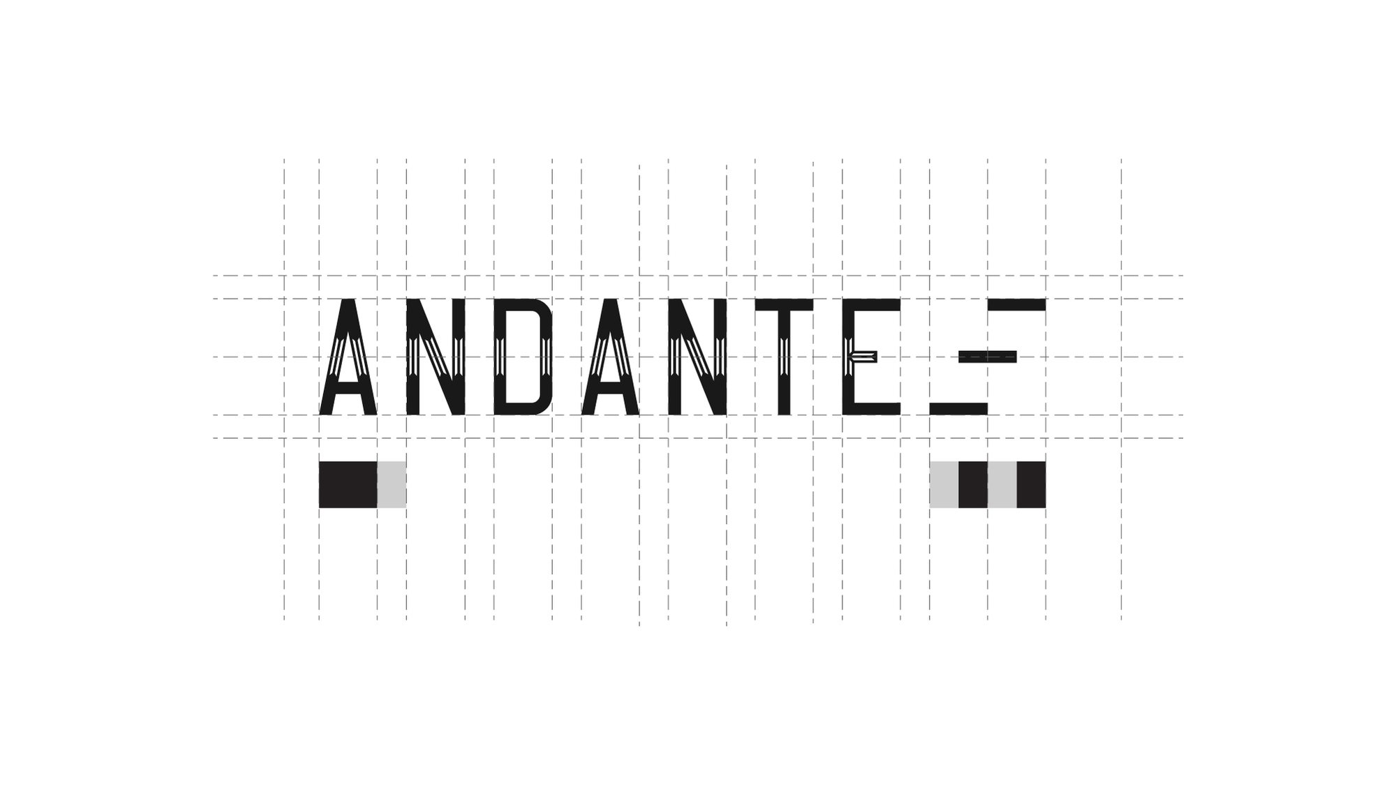
It is built on a grid, so the spacing between the A and the N is the same relationship as the spacing between the T and the E. That is the difference between a mark that looks right at any size and one that only looks right at the size it was drawn.
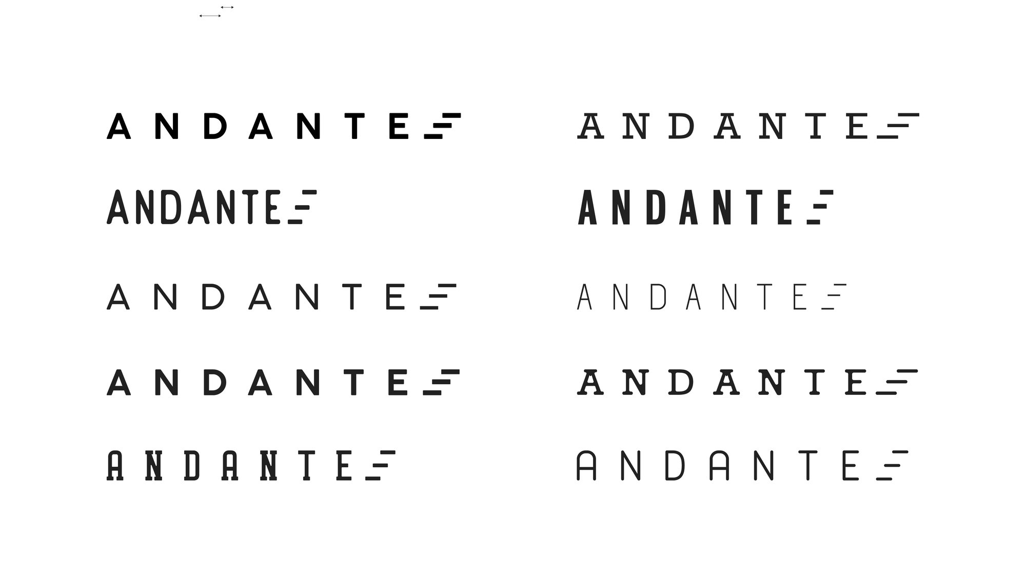
Then it gets tested — weights, widths, spacing, and what survives when you take the colour away.
Redesigns
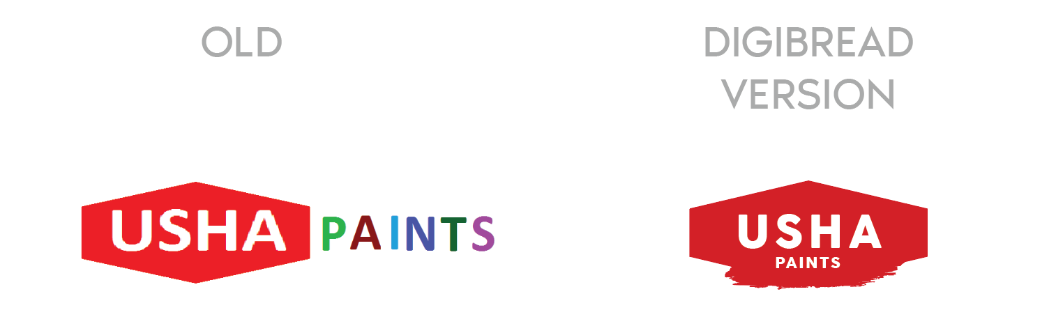
The mark on the left is what walked in the door.
A rebrand is not a fresh start. The job is to keep whatever recognition the old mark earned and throw away the rest.
-
USHA Paints
The old mark had two competing weights and no shape of its own. The redesign keeps the equity in the name and gives it a container that survives being stencilled on a tin.
-
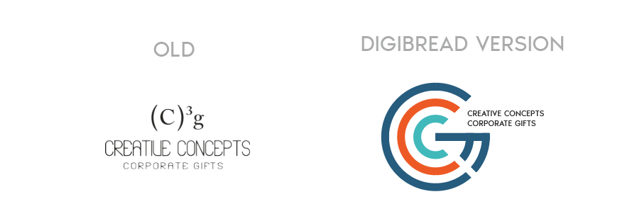
Creative Concepts
A typed superscript replaced with a drawn monogram — the same two letters, but now something that can be embroidered, embossed and read at 12mm.
-
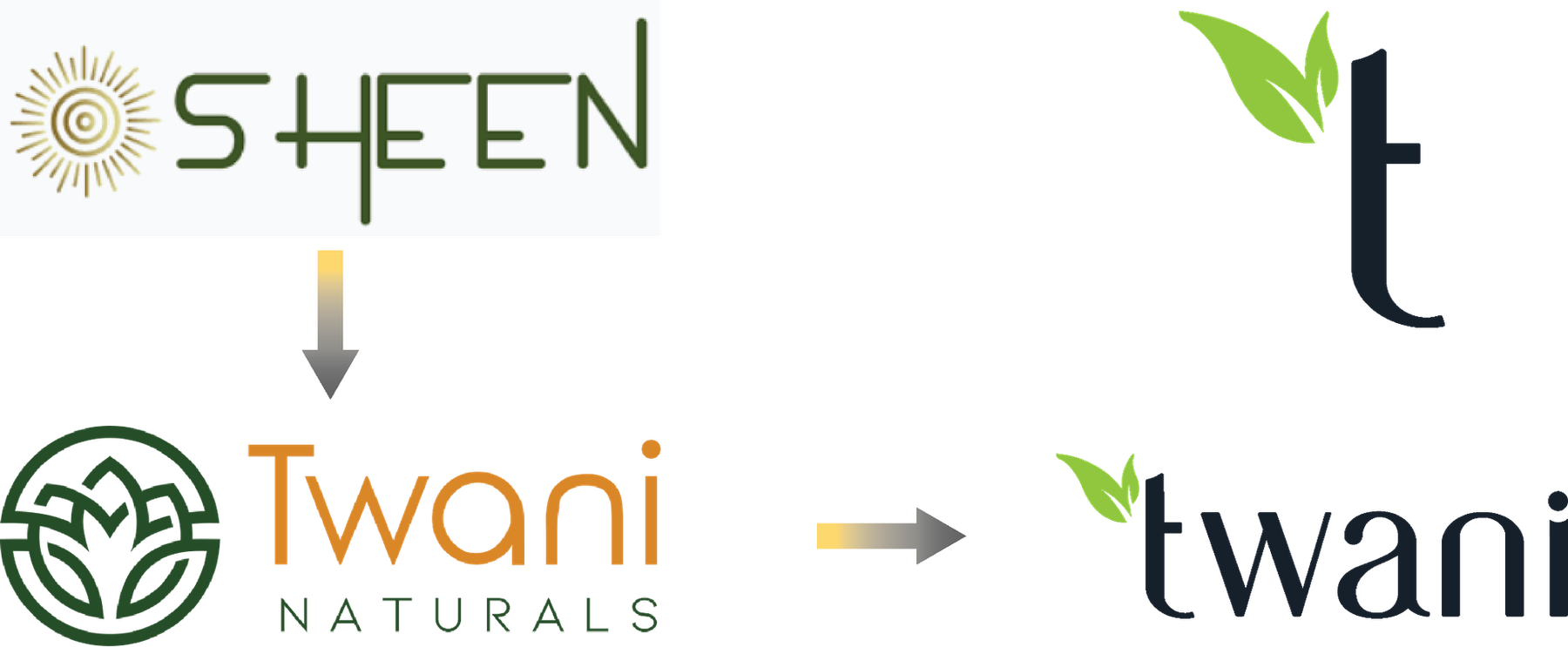
SHEEN to Twani
A full rename, in two moves. The leaf that was decoration in the middle version becomes the stem of the t in the final one.
One brand, sixteen answers
You see one logo. There were fifteen others.
Presenting a single option is a way of hiding the work. Every route below was drawn properly, set on four different grounds, and shown side by side — because the only way to know a mark is right is to see what it beat.
-
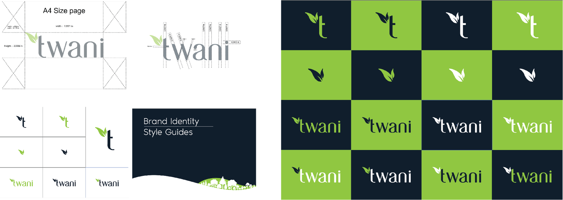
Four families, sixteen routes -
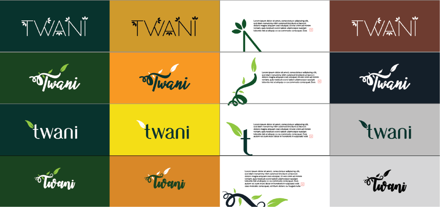
Each one tested on four grounds -
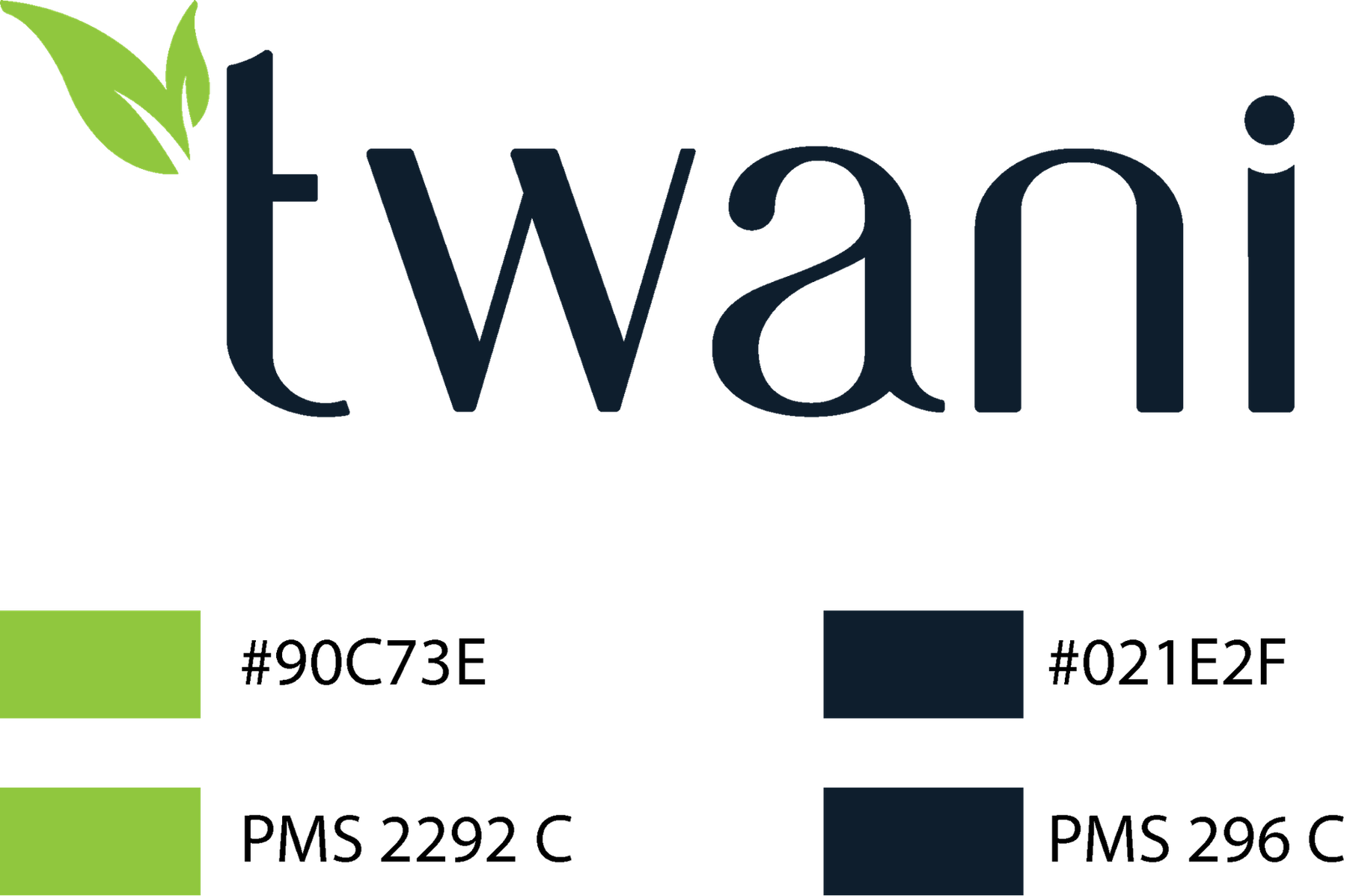
The chosen mark, specified in Pantone
The wall
Marks we have drawn or rebuilt.
27 of them