Brand Identity & Print
Amma's Kitchen
Food & Beverage
The brief
A restaurant needs more printed matter than almost any other kind of small business, and it needs all of it on the day it opens. This was the complete set.
The challenge
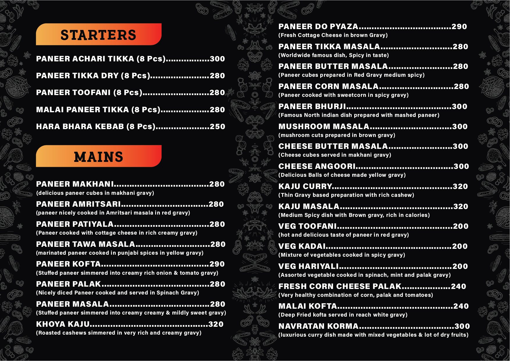
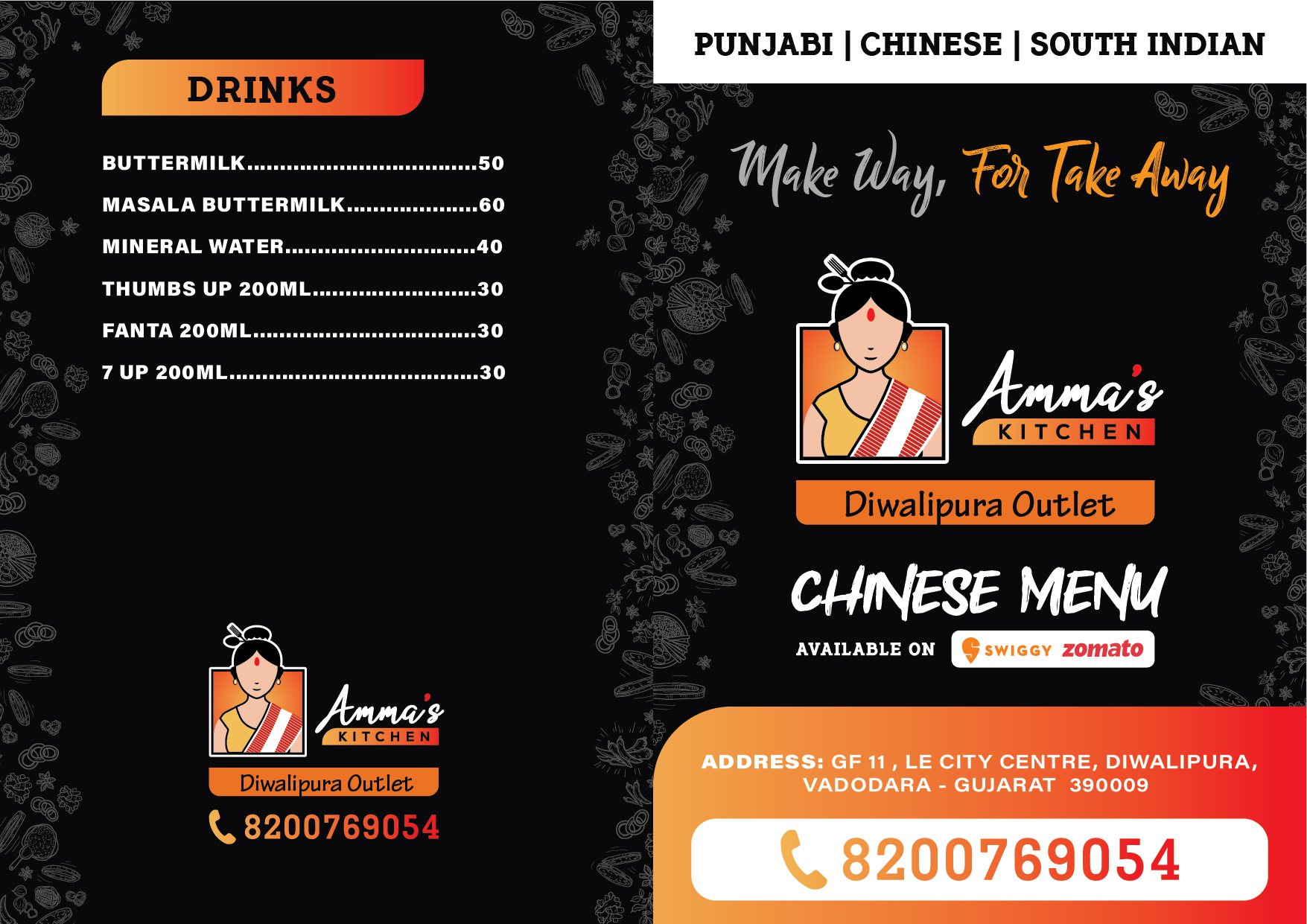
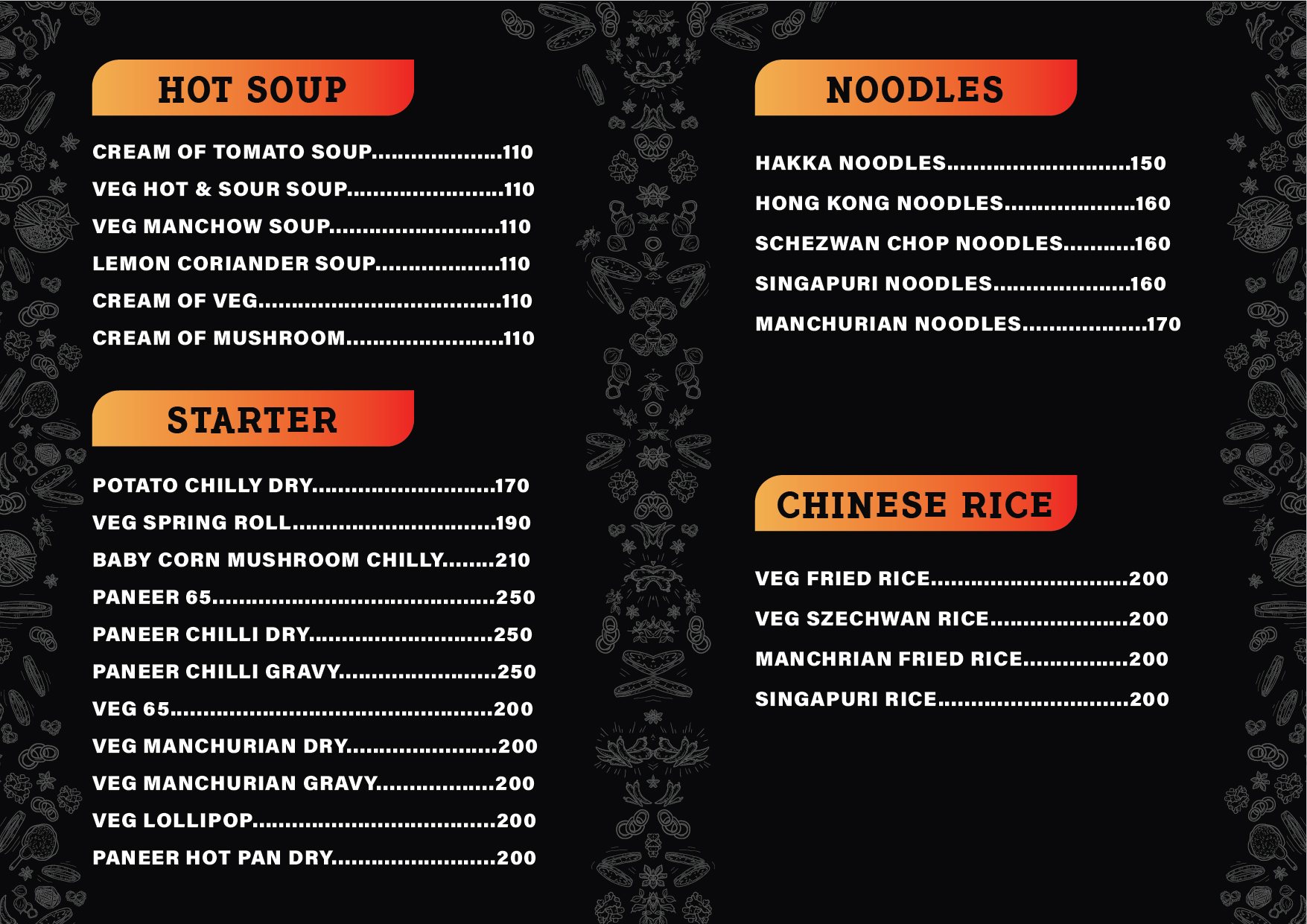
Everything had to exist on opening day. A restaurant cannot open with the menu still at the printer, and it cannot reprint a thousand menus because the logo did not hold at small sizes on uncoated stock. The menu was the difficult piece. It had to carry a long list legibly, survive being handled by every customer, and be laid out so a dish could be added or a price changed without redrawing the page. The identity had to work in one colour on a bill book and in full colour on a signboard, from the same artwork.
Our approach
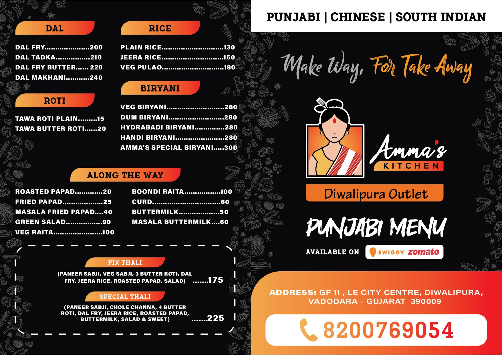
The menu was the anchor. Seven pages had to hold a long list legibly, survive being handled by every customer, and still look like the same brand as the sign outside.
How we built it
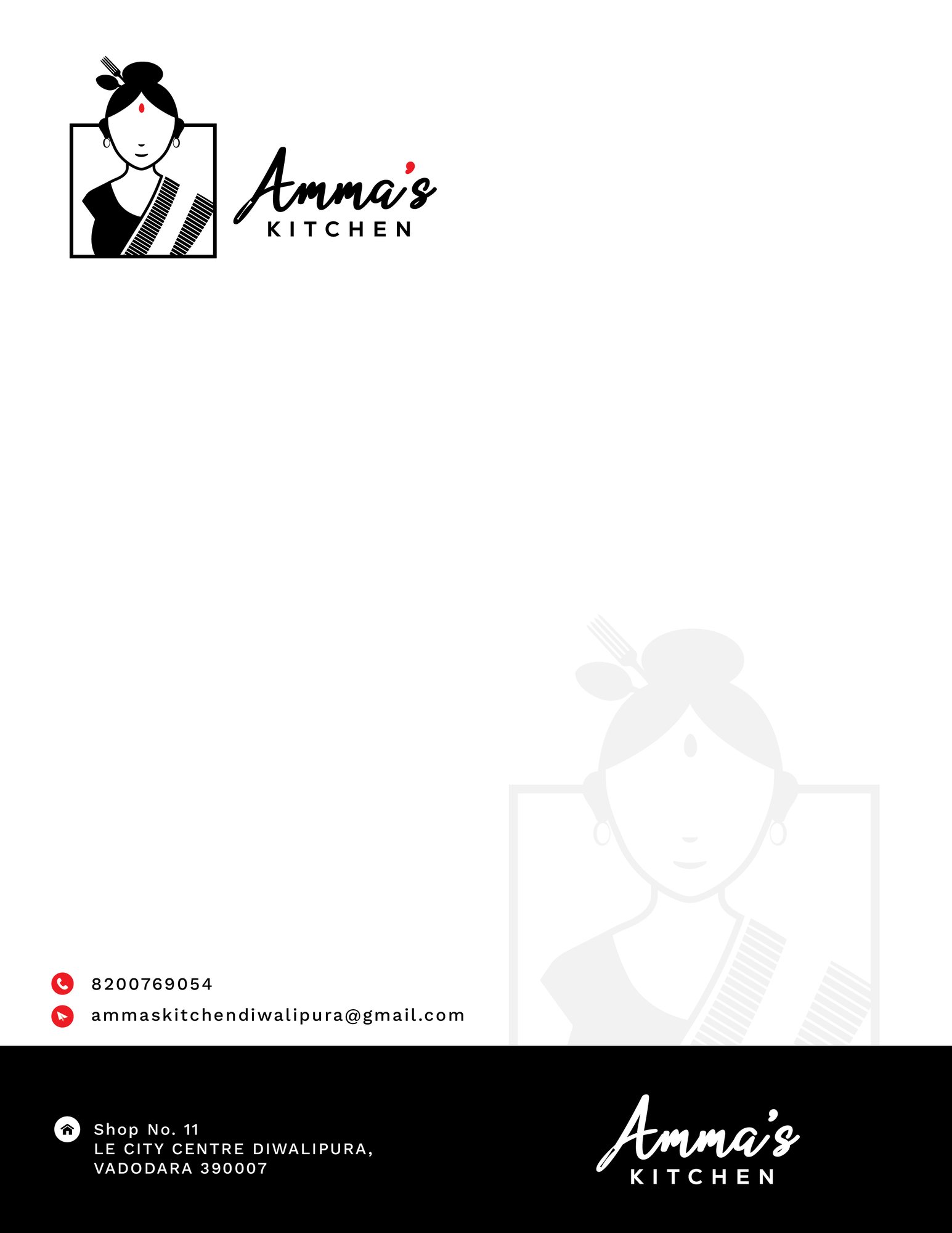
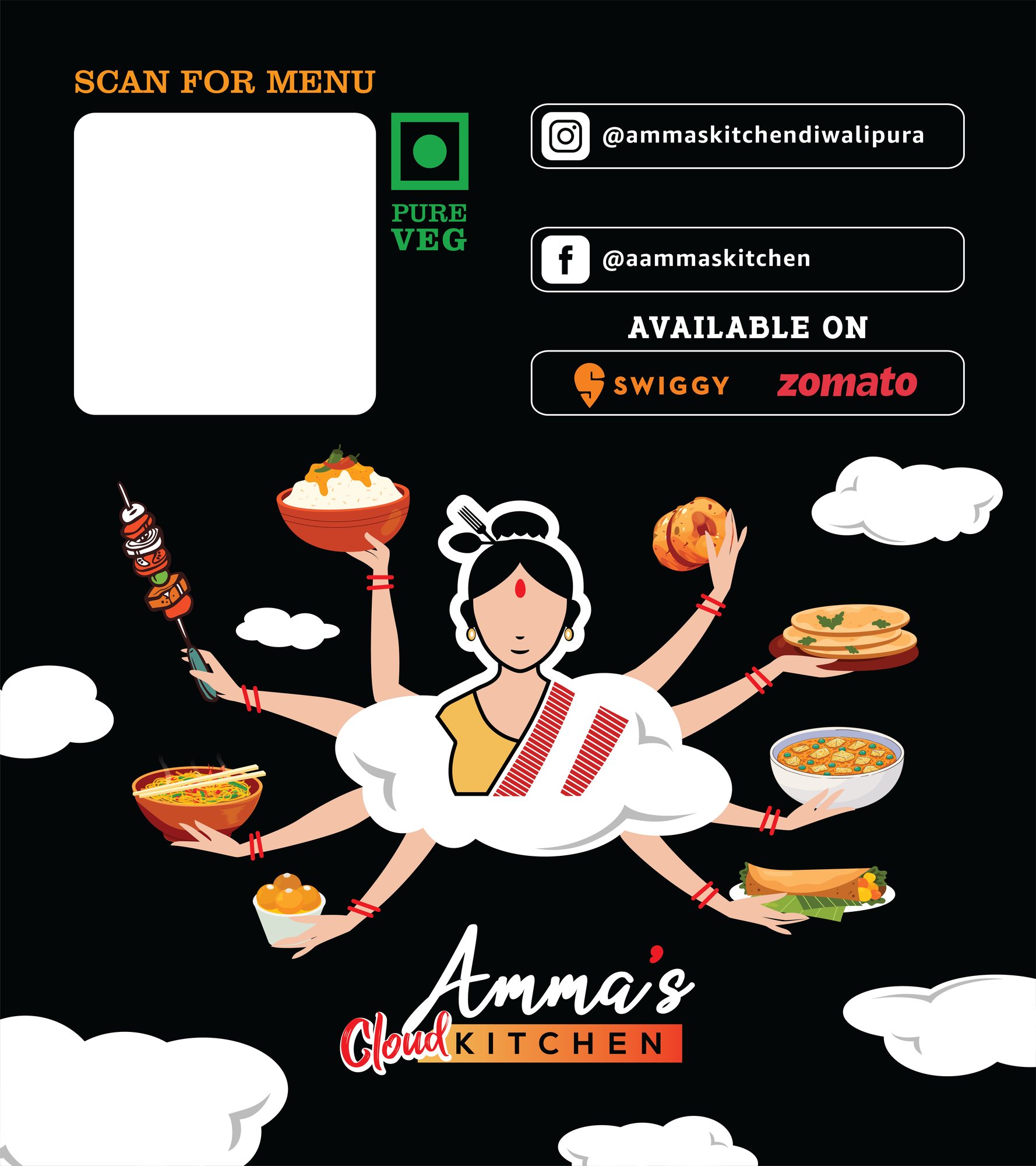
Logo in its final lockups, the seven-page menu, letterhead in RGB and print, one-way vision film for the glass, and a large-format outdoor flex — each artworked at the size it actually prints at rather than scaled up from a screen file.
The result
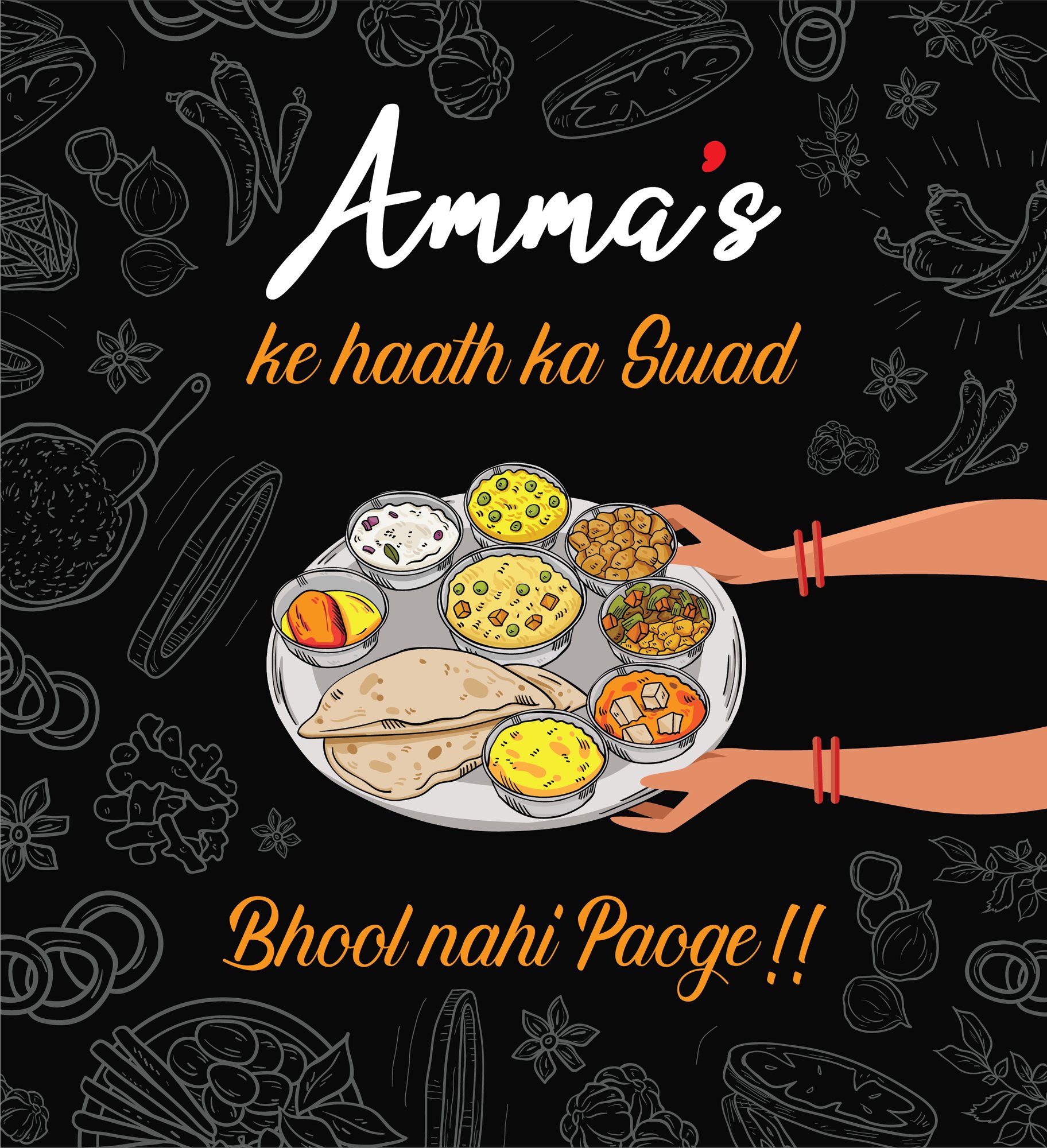
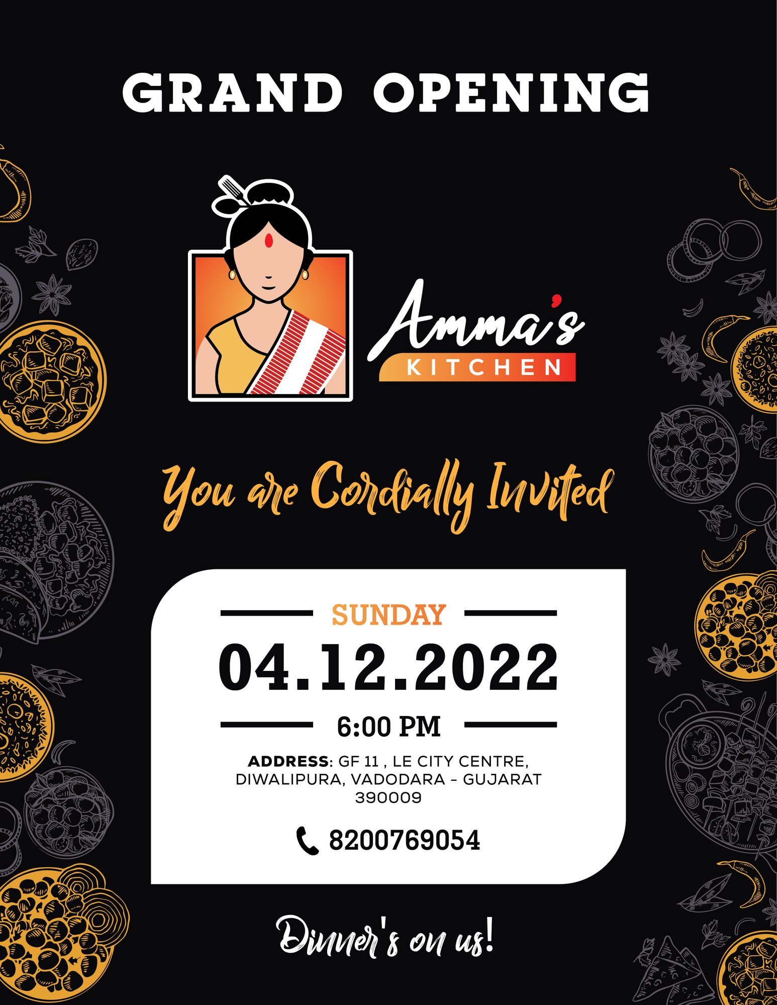
The kitchen opened with the full set in hand: logo and its variants, menus, the invitation, packaging and the printed material the day-to-day runs on. Every piece came from one artwork set, so a reprint six months later matches what is already on the wall — which is the part that usually goes wrong when a restaurant buys its print from three different suppliers.
The work
Every piece we delivered
12 files, in the order the work happened.